CSS Margins
The CSS margin properties are used to create space around elements, outside of any defined borders.
Margins define the distance between an element’s border and the surrounding elements.
With CSS, you have full control over the margins. CSS has properties for setting the margin for each individual side of an element (top, right, bottom, and left), and a shorthand property for setting all the margin properties in one declaration.
Example:
|
1 2 3 4 5 6 7 8 9 10 11 12 13 14 15 16 17 18 |
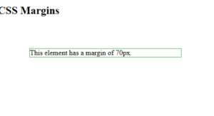
<!DOCTYPE html> <html> <head> <style> div { margin: 70px; border: 1px solid #4CAF50; } </style> </head> <body> <h2>CSS Margins</h2> <div>This element has a margin of 70px.</div> </body> </html> |
Result:
Margin – Individual Sides
CSS has properties for specifying the margin for each side of an element:
margin-top– sets the top margin of an elementmargin-right– sets the right margin of an elementmargin-bottom– sets the bottom margin of an elementmargin-left– sets the left margin of an element
All the margin properties can have the following values:
- auto – the browser calculates the margin
- length – specifies a margin in px, pt, cm, etc.
- % – specifies a margin in % of the width of the containing element
- inherit – specifies that the margin should be inherited from the parent element
Tip: Negative values are also allowed.
Set different margins for all four sides of a <p> element:
Example:
|
1 2 3 4 5 6 7 8 9 10 11 12 13 14 15 16 17 18 19 20 21 22 |
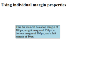
<!DOCTYPE html> <html> <head> <style> div { border: 1px solid black; margin-top: 100px; margin-bottom: 100px; margin-right: 150px; margin-left: 80px; background-color: lightblue; } </style> </head> <body> <h2>Using individual margin properties</h2> <div>This div element has a top margin of 100px, a right margin of 150px, a bottom margin of 100px, and a left margin of 80px.</div> </body> </html> |
Result:
Margin – Shorthand Property
To shorten the code, it is possible to specify all the margin properties in one declaration.
The margin property is a shorthand property for the following individual margin properties:
Here is how it works:
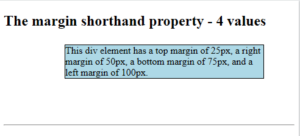
If the margin property has four values:
- margin: 25px 50px 75px 100px;
- top margin is 25px
- right margin is 50px
- bottom margin is 75px
- left margin is 100px
Use the margin shorthand property with four values:
Example:
|
1 2 3 4 5 6 7 8 9 10 11 12 13 14 15 16 17 18 19 20 21 |
<!DOCTYPE html> <html> <head> <style> div { border: 1px solid black; margin: 25px 50px 75px 100px; background-color: lightblue; } </style> </head> <body> <h2>The margin shorthand property - 4 values</h2> <div>This div element has a top margin of 25px, a right margin of 50px, a bottom margin of 75px, and a left margin of 100px.</div> <hr> </body> </html> |
Result:
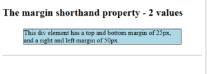
If the margin property has two values:
- margin: 25px 50px;
- top and bottom margins are 25px
- right and left margins are 50px
Example:
|
1 2 3 4 5 6 7 8 9 10 11 12 13 14 15 16 17 18 19 20 21 |
<!DOCTYPE html> <html> <head> <style> div { border: 1px solid black; margin: 25px 50px; background-color: lightblue; } </style> </head> <body> <h2>The margin shorthand property - 2 values</h2> <div>This div element has a top and bottom margin of 25px, and a right and left margin of 50px.</div> <hr> </body> </html> |
Result:
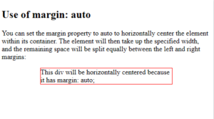
The auto Value
You can set the margin property to auto to horizontally center the element within its container.
The element will then take up the specified width, and the remaining space will be split equally between the left and right margins.
Example:
|
1 2 3 4 5 6 7 8 9 10 11 12 13 14 15 16 17 18 19 20 21 22 |
<!DOCTYPE html> <html> <head> <style> div { width: 300px; margin: auto; border: 1px solid red; } </style> </head> <body> <h2>Use of margin: auto</h2> <p>You can set the margin property to auto to horizontally center the element within its container. The element will then take up the specified width, and the remaining space will be split equally between the left and right margins:</p> <div> This div will be horizontally centered because it has margin: auto; </div> </body> </html> |
Result:
CSS Margin Collapse
Margin collapse is when two margins collapse into a single margin.
Top and bottom margins of elements are sometimes collapsed into a single margin that is equal to the largest of the two margins.
Note: Margin collapse only happens with top and bottom margins! Not left and right margins!
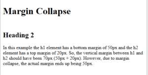
In the following example, the <h1> element has a bottom margin of 50px and the <h2> element has a top margin of 20px. So, the vertical margin between the <h1> and the <h2> would be a total of 70px (50px + 20px). But due to margin collapse, the actual margin ends up being 50px:
Example:
|
1 2 3 4 5 6 7 8 9 10 11 12 13 14 15 16 17 18 19 20 21 22 |
<!DOCTYPE html> <html> <head> <style> h1 { margin-bottom: 50px; } h2 { margin-top: 20px; } </style> </head> <body> <h1>Margin Collapse</h1> <h2>Heading 2</h2> <p>In this example the h1 element has a bottom margin of 50px and the h2 element has a top margin of 20px. So, the vertical margin between h1 and h2 should have been 70px (50px + 20px). However, due to margin collapse, the actual margin ends up being 50px.</p> </body> </html> |
Result:
All CSS Margin Properties
| Property | Description |
|---|---|
| margin | A shorthand property for setting all the margin properties in one declaration |
| margin-bottom | Sets the bottom margin of an element |
| margin-left | Sets the left margin of an element |
| margin-right | Sets the right margin of an element |
| margin-top | Sets the top margin of an element |
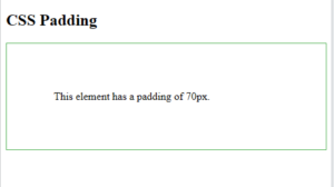
CSS Padding
The CSS padding properties are used to generate space around an element’s content, inside of any defined borders.
With CSS, you have full control over the padding. There are properties for setting the padding for each side of an element (top, right, bottom, and left), and a shorthand property for setting all the padding properties in one declaration.
Example:
|
1 2 3 4 5 6 7 8 9 10 11 12 13 14 15 16 17 |
<!DOCTYPE html> <html> <head> <style> div { padding: 70px; border: 1px solid #4CAF50; } </style> </head> <body> <h2>CSS Padding</h2> <div>This element has a padding of 70px.</div> </body> </html> |
Result:
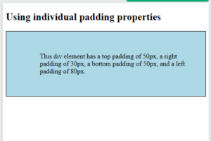
Padding – Individual Sides
CSS has properties for specifying the padding for each side of an element:
padding-top– sets the top padding of an elementpadding-right– sets the right padding of an elementpadding-bottom– sets the bottom padding of an elementpadding-left– sets the left padding of an element
All the padding properties can have the following values:
- length – specifies a padding in px, pt, cm, etc.
- % – specifies a padding in % of the width of the containing element
- inherit – specifies that the padding should be inherited from the parent element
Note: Negative values are not allowed.
Example:
|
1 2 3 4 5 6 7 8 9 10 11 12 13 14 15 16 17 18 19 20 21 22 |
<!DOCTYPE html> <html> <head> <style> div { border: 1px solid black; background-color: lightblue; padding-top: 50px; padding-right: 30px; padding-bottom: 50px; padding-left: 80px; } </style> </head> <body> <h2>Using individual padding properties</h2> <div>This div element has a top padding of 50px, a right padding of 30px, a bottom padding of 50px, and a left padding of 80px.</div> </body> </html> |
Result:
Padding – Shorthand Property
To shorten the code, it is possible to specify all the padding properties in one declaration.
The padding property is a shorthand property for the following individual padding properties:
Here is how it works:
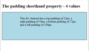
If the padding property has four values:
- padding: 25px 50px 75px 100px;
- top padding is 25px
- right padding is 50px
- bottom padding is 75px
- left padding is 100px
Example:
|
1 2 3 4 5 6 7 8 9 10 11 12 13 14 15 16 17 18 19 |
<!DOCTYPE html> <html> <head> <style> div { border: 1px solid black; padding: 25px 50px 75px 100px; background-color: lightblue; } </style> </head> <body> <h2>The padding shorthand property - 4 values</h2> <div>This div element has a top padding of 25px, a right padding of 50px, a bottom padding of 75px, and a left padding of 100px.</div> </body> </html> |
Result:
CSS box-sizing
Padding and Element Width
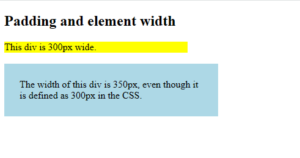
The CSS width property specifies the width of the element’s content area. The content area is the portion inside the padding, border, and margin of an element (the box model).
So, if an element has a specified width, the padding added to that element will be added to the total width of the element. This is often an undesirable result.
Example:
|
1 2 3 4 5 6 7 8 9 10 11 12 13 14 15 16 17 18 19 20 21 22 23 24 25 26 27 |
<!DOCTYPE html> <html> <head> <style> div.ex1 { width: 300px; background-color: yellow; } div.ex2 { width: 300px; padding: 25px; background-color: lightblue; } </style> </head> <body> <h2>Padding and element width</h2> <div class="ex1">This div is 300px wide.</div> <br> <div class="ex2">The width of this div is 350px, even though it is defined as 300px in the CSS.</div> </body> </html> |
Result:
Padding and box-sizing
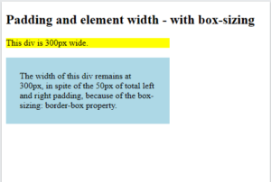
The box-sizing property defines how the width and height of an element are calculated: should they include padding and borders, or not.
The box-sizing property can have the following values:
content-box– This is default. The width and height properties includes only the content (border and padding are not included)border-box– The width and height properties includes content, padding and border
So, to keep the width at 300px, no matter the amount of padding, you can use the box-sizing: border-box;. This causes the element to maintain its actual width; if you increase the padding, the available content space will decrease.
Example:
|
1 2 3 4 5 6 7 8 9 10 11 12 13 14 15 16 17 18 19 20 21 22 23 24 25 26 27 28 29 |
<!DOCTYPE html> <html> <head> <style> div.ex1 { width: 300px; background-color: yellow; } div.ex2 { width: 300px; padding: 25px; box-sizing: border-box; background-color: lightblue; } </style> </head> <body> <h2>Padding and element width - with box-sizing</h2> <div class="ex1">This div is 300px wide.</div> <br> <div class="ex2">The width of this div remains at 300px, in spite of the 50px of total left and right padding, because of the box-sizing: border-box property. </div> </body> </html> |
Result:
All CSS Padding Properties
| Property | Description |
|---|---|
| padding | A shorthand property for setting all the padding properties in one declaration |
| padding-bottom | Sets the bottom padding of an element |
| padding-left | Sets the left padding of an element |
| padding-right | Sets the right padding of an element |
| padding-top | Sets the top padding of an element |
CSS Height and Width
CSS Height and Width
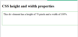
The CSS height and width properties are used to set the height and width of an element.
Example:
|
1 2 3 4 5 6 7 8 9 10 11 12 13 14 15 16 17 18 19 20 |
<!DOCTYPE html> <html> <head> <style> div { height: 70px; width: 100%; border: 1px solid #4CAF50; padding: 8px; } </style> </head> <body> <h2>CSS height and width properties</h2> <div>This div element has a height of 70 pixels and a width of 100%.</div> </body> </html> |
Result:
CSS Set height and width
The height and width properties are used to set the height and width of an element.
The height and width do not include padding, borders, or margins. It sets the height and width of the area inside the padding, border, and margin of the element.
CSS height and width Values
The height and width properties can have the following values:
auto– This is default. The browser calculates the height and widthlength– Defines the height or width in px, cm, em, etc.%– Defines the height or width in percent of the containing blockinitial– Sets the height or width to its default valueinherit– The height or width will be inherited from its parent value
CSS height and width
Example:
|
1 2 3 4 5 6 7 8 9 10 11 12 13 14 15 16 17 18 19 |
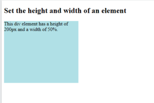
<!DOCTYPE html> <html> <head> <style> div { height: 200px; width: 50%; background-color: powderblue; } </style> </head> <body> <h2>Set the height and width of an element</h2> <div>This div element has a height of 200px and a width of 50%.</div> </body> </html> |
Result:
Example:
|
1 2 3 4 5 6 7 8 9 10 11 12 13 14 15 16 17 18 19 |
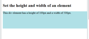
<!DOCTYPE html> <html> <head> <style> div { height: 100px; width: 500px; background-color: powderblue; } </style> </head> <body> <h2>Set the height and width of an element</h2> <div>This div element has a height of 100px and a width of 500px.</div> </body> </html> |
Result:
CSS Min/Max Height and Width
CSS Min/Max Height and Width
The min-width and max-width properties are used to set the minimum and maximum width of an element.
The min-height and max-height properties are used to set the minimum and maximum height of an element.
CSS Using max-width
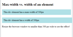
The max-width property sets the maximum allowed width of an element. This prevents the width of an element to be larger than the max-width property value.
The max-width property can have the following values:
length– Defines the maximum width in px, cm, etc.%– Defines the maximum width in percent of the containing blocknone– This is default. Means that there is no maximum width
One problem with the width property can occur when the browser window is smaller than the width of the element. The browser then adds a horizontal scrollbar to the page. So, using max-width will improve the browser’s handling on small windows.
Example:
|
1 2 3 4 5 6 7 8 9 10 11 12 13 14 15 16 17 18 19 20 21 22 23 24 25 26 27 28 29 30 31 |
<!DOCTYPE html> <html> <head> <style> .div1 { max-width: 500px; padding:10px; background-color: powderblue; } .div2 { width: 500px; padding:10px; background-color: powderblue; } </style> </head> <body> <h2>Max-width vs. width of an element</h2> <div class="div1">This div element has a max-width of 500px</div> <br> <div class="div2">This div element has a width of 500px.</div> <p>Resize the browser window to smaller than 500 px wide to see the effect!</p> </body> </html> |
Result:
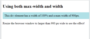
Note: If you use both the width property and the max-width property on the same element, and the value of the width property is larger than the max-width property; the max-width property value will be used!
Example:
|
1 2 3 4 5 6 7 8 9 10 11 12 13 14 15 16 17 18 19 20 21 22 |
<!DOCTYPE html> <html> <head> <style> .div1 { width: 100%; /* The element will try to be 100% of its parent's width */ max-width: 900px; /* But it will never exceed 900px in width */ padding:10px; background-color: powderblue; } </style> </head> <body> <h2>Using both max-width and width</h2> <div class="div1">This div element has a width of 100% and a max-width of 900px.</div> <p>Resize the browser window to larger than 900 px wide to see the effect!</p> </body> </html> |
Result:
All CSS Dimension Properties
| Property | Description |
|---|---|
| height | Sets the height of an element |
| max-height | Sets the maximum height of an element |
| max-width | Sets the maximum width of an element |
| min-height | Sets the minimum height of an element |
| min-width | Sets the minimum width of an element |
| width | Sets the width of an element |