CSS Attribute Selectors
CSS attribute selectors are used to select and style HTML elements with a specific attribute or attribute value, or both.
Attribute selectors are enclosed in square brackets [].
CSS has the following attribute selectors:
[attribute]– Select elements with the specified attribute[attribute="value"]– Select elements with a specific attribute and an exact value[attribute~="value"]– Select elements with an attribute value containing a specific word[attribute|="value"]– Select elements with the specific attribute, whose value can be exactly the value, or start with the value followed by a hyphen (-)[attribute^="value"]– Select elements whose attribute value starts with a specific value[attribute$="value"]– Select elements whose attribute value ends with a specific value[attribute*="value"]– Select elements whose attribute value contains a specific value
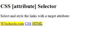
CSS [attribute] Selector
The [attribute] selector is used to select elements with the specified attribute.
The following example selects all <a> elements with a target attribute:
Example
|
1 2 3 4 5 6 7 8 9 10 11 12 13 14 15 16 17 18 19 20 21 |
<!DOCTYPE html> <html> <head> <style> a[target] { background-color: yellow; } </style> </head> <body> <h2>CSS [attribute] Selector</h2> <p>Select and style the links with a target attribute:</p> <a href="https://www.w3schools.com" target="_blank">W3schools.com</a> <a href="https://www.w3schools.com/css/">CSS</a> <a href="https://www.w3schools.com/html/" target="_blank">HTML</a> </body> </html> |
Result
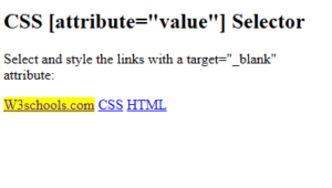
CSS [attribute=”value”] Selector
The [attribute="value"] selector is used to select elements with a specific attribute with an exact value.
The following example selects all <a> elements with a target=”_blank” attribute:
Example
|
1 2 3 4 5 6 7 8 9 10 11 12 13 14 15 16 17 18 19 20 21 |
<!DOCTYPE html> <html> <head> <style> a[target=_blank] { background-color: yellow; } </style> </head> <body> <h2>CSS [attribute="value"] Selector</h2> <p>Select and style the links with a target="_blank" attribute:</p> <a href="https://www.w3schools.com" target="_blank">W3schools.com</a> <a href="https://www.w3schools.com/css/">CSS</a> <a href="https://www.w3schools.com/html/" target="_top">HTML</a> </body> </html> |
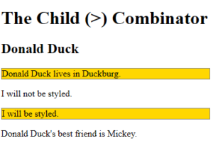
CSS Child (>) Combinator
Definition and Usage
The CSS child combinator (>) is used to select elements that are direct children of a specific parent.
Elements matched by the second selector must be the immediate children of the elements matched by the first selector.
Example
|
1 2 3 4 5 6 7 8 9 10 11 12 13 14 15 16 17 18 19 20 21 22 23 24 25 26 27 28 |
<!DOCTYPE html> <html> <head> <style> div > p { background-color: gold; border: 1px solid gray; } </style> </head> <body> <h1>The Child (>) Combinator</h1> <div> <h2>Donald Duck</h2> <p>Donald Duck lives in Duckburg.</p> </div> <div> <span><p>I will not be styled.</p></span> <p>I will be styled.</p> </div> <p>Donald Duck's best friend is Mickey.</p> </body> </html> |
Result
CSS Pseudo-classes
A CSS pseudo-class is a keyword that can be added to a selector, to define a style for a special state of an element.
Some common use for pseudo-classes:
- Style an element when a user moves the mouse over it
- Style visited and unvisited links differently
- Style an element when it gets focus
- Style valid/invalid/required/optional form elements
- Style an element that is the first child of its parent
Interactive Pseudo-classes
Interactive pseudo-classes apply styles based on user interaction:
:hover– When mouse is over an element:focus– When an element has focus:active– When an element is being activated:link– Unvisited links:visited– Visited links
Structural Pseudo-classes
Structural pseudo-classes select elements based on their position in the document tree:
:first-child– First child of a parent:last-child– Last child of a parent:nth-child(n)– The nth child of a parent:lang()– Elements with a specific language
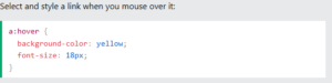
CSS :hover Pseudo-class
Definition and Usage
The CSS :hover pseudo-class is used to select elements when you mouse over them.
Example
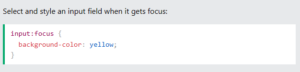
CSS :focus Pseudo-class
Definition and Usage
The CSS :focus pseudo-class is used to select and style the element that gets focus.
Example
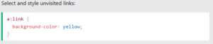
CSS :link Pseudo-class
Definition and Usage
The CSS :link pseudo-class is used to select and style unvisited links.
Example
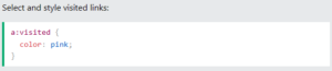
CSS :visited Pseudo-class
Definition and Usage
The CSS :visited pseudo-class is used to style visited links.
Example
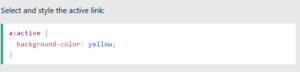
CSS :active Pseudo-class
Definition and Usage
The CSS :active pseudo-class is used to select and style an element that is being activated by the user.
Example
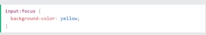
:focus on <input>
Here is an example of using the :focus pseudo-class to style an input field when it gets focus:
Example
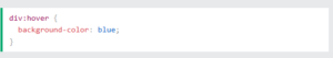
:hover on <div>
Here is an example of using the :hover pseudo-class on a <div> element:
Example
CSS Pseudo-Elements
A CSS pseudo-element is a keyword that can be added to a selector, to style a specific part of an element.
Some common use for pseudo-elements:
- Style the first letter or first line, of an element
- Insert content before or after an element
- Style the markers of list items
- Style the user-selected portion of an element
- Style the viewbox behind a dialog box
Text Pseudo-elements
Text pseudo-elements style specific parts of text content:
::first-line– Style the first line of text::first-letter– Style the first letter of text
Content Pseudo-elements
Content pseudo-elements insert or style generated content:
::before– Insert content before an element::after– Insert content after an element::marker– Style list item markers::selection– Style user-selected text::backdrop– Style dialog backdrop
Pseudo-elements for Text
Pseudo-elements for text, allow you to style specific parts of text content, such as the first line or first letter.
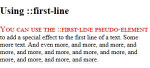
The CSS ::first-line Pseudo-element
The ::first-line pseudo-element is used to add a special style to the first line of a text.
Example
|
1 2 3 4 5 6 7 8 9 10 11 12 13 14 15 16 17 18 19 |
<!DOCTYPE html> <html> <head> <style> p::first-line { color: red; font-variant: small-caps; font-size: 19px; } </style> </head> <body> <h2>Using ::first-line</h2> <p>You can use the ::first-line pseudo-element to add a special effect to the first line of a text. Some more text. And even more, and more, and more, and more, and more, and more, and more, and more, and more, and more, and more, and more.</p> </body> </html> |
Result
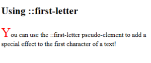
The CSS ::first-letter Pseudo-element
The ::first-letter pseudo-element is used to add a special style to the first letter of a text.
Example
|
1 2 3 4 5 6 7 8 9 10 11 12 13 14 15 16 17 18 |
<!DOCTYPE html> <html> <head> <style> p::first-letter { color: #ff0000; font-size: xx-large; } </style> </head> <body> <h2>Using ::first-letter</h2> <p>You can use the ::first-letter pseudo-element to add a special effect to the first character of a text!</p> </body> </html> |
Result
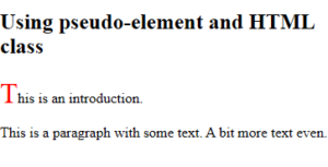
Pseudo-elements and HTML Classes
Pseudo-elements can easily be combined with HTML classes.
Example
|
1 2 3 4 5 6 7 8 9 10 11 12 13 14 15 16 17 18 19 |
<!DOCTYPE html> <html> <head> <style> p.intro::first-letter { color: #ff0000; font-size: 200%; } </style> </head> <body> <h2>Using pseudo-element and HTML class</h2> <p class="intro">This is an introduction.</p> <p>This is a paragraph with some text. A bit more text even.</p> </body> </html> |
Result
Pseudo-elements for Content
Pseudo-elements for content allow you to insert content before or after elements, style list markers, and more.
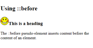
The CSS ::before Pseudo-element
The ::before pseudo-element is used to insert some content before the content of a specified element.
Use the content property to specify the content to insert.
Example
|
1 2 3 4 5 6 7 8 9 10 11 12 13 14 15 16 17 18 |
<!DOCTYPE html> <html> <head> <style> h3::before { content: url(smiley.gif); } </style> </head> <body> <h2>Using ::before</h2> <h3>This is a heading</h3> <p>The ::before pseudo-element inserts content before the content of an element.</p> </body> </html> |
Result
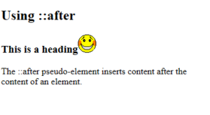
The CSS ::after Pseudo-element
The ::after pseudo-element is used to insert some content after the content of a specified element.
Use the content property to specify the content to insert.
Example
|
1 2 3 4 5 6 7 8 9 10 11 12 13 14 15 16 17 18 |
<!DOCTYPE html> <html> <head> <style> h3::after { content: url(smiley.gif); } </style> </head> <body> <h2>Using ::after</h2> <h3>This is a heading</h3> <p>The ::after pseudo-element inserts content after the content of an element.</p> </body> </html> |
Result
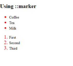
The CSS ::marker Pseudo-element
The ::marker pseudo-element is used to style the list item markers.
Example
|
1 2 3 4 5 6 7 8 9 10 11 12 13 14 15 16 17 18 19 20 21 22 23 24 25 26 27 28 |
<!DOCTYPE html> <html> <head> <style> ::marker { color: red; font-size: 23px; } </style> </head> <body> <h2>Using ::marker</h2> <ul> <li>Coffee</li> <li>Tea</li> <li>Milk</li> </ul> <ol> <li>First</li> <li>Second</li> <li>Third</li> </ol> </body> </html> |
Result
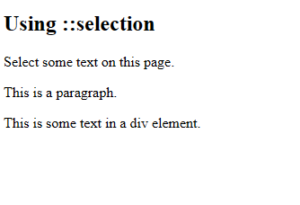
The CSS ::selection Pseudo-element
The ::selection pseudo-element is used to style the part of a text that is selected by a user.
Example
|
1 2 3 4 5 6 7 8 9 10 11 12 13 14 15 16 17 18 19 20 |
<!DOCTYPE html> <html> <head> <style> ::selection { color: red; background: yellow; } </style> </head> <body> <h2>Using ::selection</h2> <p>Select some text on this page.</p> <p>This is a paragraph.</p> <div>This is some text in a div element.</div> </body> </html> |
Result
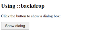
The CSS ::backdrop Pseudo-element
The ::backdrop pseudo-element is used to style the viewbox behind a dialog box or popover element.
Example
|
1 2 3 4 5 6 7 8 9 10 11 12 13 14 15 16 17 18 19 20 21 22 23 24 25 26 27 28 29 30 31 32 33 34 35 36 37 |
<!DOCTYPE html> <html> <head> <style> button { font-size: 15px; padding: 5px 15px; } dialog::backdrop { background-color: lightgreen; } </style> </head> <body> <h2>Using ::backdrop</h2> <p>Click the button to show a dialog box:</p> <button id="dialogBtn">Show dialog</button> <dialog id="myDialog"> <form method="dialog"> <p>The background behind this dialog, is a backdrop.</p> <button>Close dialog</button> </form> </dialog> <script> const dialogBtn = document.getElementById('dialogBtn'); const myDialog = document.getElementById('myDialog'); dialogBtn.addEventListener('click', () => myDialog.showModal()); </script> </body> </html> |
Result