CSS Grid Components
A grid always consists of:
- A Grid Container – The parent (container) element, where the
displayproperty is set togridorinline-grid - One or more Grid Items – The direct children of the grid container automatically becomes grid items
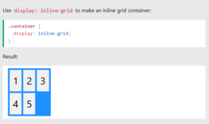
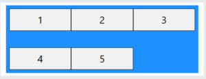
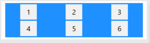
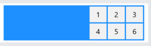
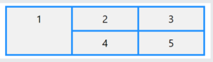
Example
|
1 2 3 4 5 6 7 8 9 10 11 12 13 14 15 16 17 18 19 20 21 22 23 24 25 26 27 28 29 30 31 32 33 34 35 36 |
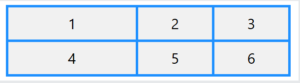
<!DOCTYPE html> <html> <head> <style> .container { display: grid; grid-template-columns: auto auto auto; background-color: dodgerblue; padding: 10px; } .container div { background-color: #f1f1f1; border: 1px solid black; padding: 10px; font-size: 30px; text-align: center; } </style> </head> <body> <h1>Grid Layout</h1> <p>A Grid Layout must have a parent element with the <em>display</em> property set to <em>grid</em> or <em>inline-grid</em>.</p> <div class="container"> <div>1</div> <div>2</div> <div>3</div> <div>4</div> <div>5</div> </div> </body> </html> |
Result
CSS Grid Container
A grid container contains one or more grid items arranged in columns and rows.
All direct child elements of a grid container automatically become grid items.
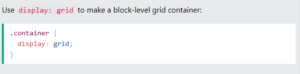
An element becomes a grid container when its display property is set to grid or inline-grid.
Display Grid Property
The <div> element becomes a grid container when its display property is set to grid or inline-grid.
Example:
CSS Grid Tracks
CSS Grid Tracks (Rows and Colums)
Inside the grid container you define the number and size of the grid columns and rows.
For this, we will use the following properties:
grid-template-columns– Defines the number and width of the columns in the gridgrid-template-rows– Defines the number and height of the rows in the gridgrid-template-areas– Defines how to display columns and rows, using named grid items
The CSS grid-template-columns Property
The grid-template-columns property defines the number and width of the columns in the grid.
The value is a space-separated-list, where each value defines the width of the respective column.
Common values are:
- Fixed lengths (100px 300px 200px)
- Percentages (20% 60% 20%)
- fr unit (1fr 2fr 1fr)
- auto (auto auto auto)
- repeat() (repeat(3, 1fr))
- minmax() (minmax(80px, 1fr) 150px 150px)
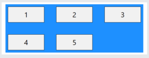
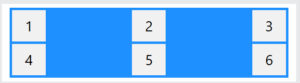
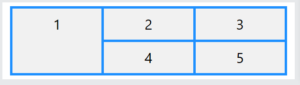
CSS grid-template-columns: auto
To create a grid layout with 3 columns of equal width, use the “auto” keyword.
Example:
|
1 2 3 4 5 6 7 8 9 10 11 12 13 14 15 16 17 18 19 20 21 22 23 24 25 26 27 28 29 30 31 32 33 34 35 36 37 |
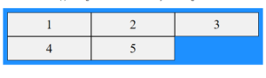
<!DOCTYPE html> <html> <head> <style> .container { display: grid; grid-template-columns: auto auto auto; background-color: dodgerblue; padding: 5px; gap: 5px; } .container div { background-color: #f1f1f1; color: #000; padding: 10px; font-size: 30px; text-align: center; } </style> </head> <body> <h1>The grid-template-columns Property</h1> <p>Create a grid with 3 columns of equal width, with the auto keyword:</p> <div class="container"> <div>1</div> <div>2</div> <div>3</div> <div>4</div> <div>5</div> <div>6</div> </div> </body> </html> |
Result:
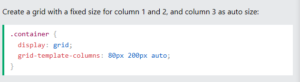
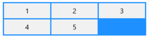
Grid Columns with Mixed Width
To create a grid layout with 3 columns: 2 columns with a fixed width, and 1 column with size “auto”.
Example:
Result:
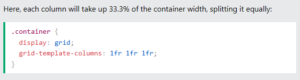
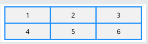
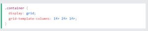
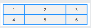
Grid Columns with the fr Unit
The fr unit stands for “fraction”. This unit automatically divides the available space into fractions.
1fr will take 1 fraction of the available space, while 2fr will take 2 fractions of the available space.
Example:
Result:
Example:
Result:
Grid Columns with the repeat() Function
The CSS repeat() function is used to repeat a set of columns or rows in a grid.
Example:
|
1 2 3 4 5 6 7 8 9 10 11 12 13 14 15 16 17 18 19 20 21 22 23 24 25 26 27 28 29 30 31 32 33 34 35 36 37 |
<!DOCTYPE html> <html> <head> <style> .container { display: grid; grid-template-columns: repeat(3, 1fr); background-color: dodgerblue; padding: 5px; gap: 5px; } .container div { background-color: #f1f1f1; color: #000; padding: 10px; font-size: 30px; text-align: center; } </style> </head> <body> <h1>The grid-template-columns Property</h1> <p>Use repeat() to create three equal-width columns in a grid:</p> <div class="container"> <div>1</div> <div>2</div> <div>3</div> <div>4</div> <div>5</div> <div>6</div> </div> </body> </html> |
Result:

Grid Columns with the minmax() Function
The CSS minmax() function is used to define a size-range greater than or equal to a min value and less than or equal to a max value.
Example:
|
1 2 3 4 5 6 7 8 9 10 11 12 13 14 15 16 17 18 19 20 21 22 23 24 25 26 27 28 29 30 31 32 33 34 35 36 37 |
<!DOCTYPE html> <html> <head> <style> .container { display: grid; grid-template-columns: minmax(80px, 1fr) 150px 150px; /* First column is at least 80px and can grow to 1fr */ background-color: dodgerblue; padding: 5px; gap: 5px; } .container div { background-color: #f1f1f1; color: #000; padding: 10px; font-size: 30px; text-align: center; } </style> </head> <body> <h1>The grid-template-columns Property</h1> <p>Use minmax() to define a size-range for the first grid column:</p> <div class="container"> <div>1</div> <div>2</div> <div>3</div> <div>4</div> <div>5</div> <div>6</div> </div> </body> </html> |
Result:
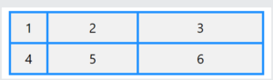
The CSS grid-template-rows Property
The grid-template-rows property defines the number and height of the rows in the grid.
The value is a space-separated-list, where each value defines the height of the respective row.
Common values are:
- Fixed lengths
- Percentages
- fr unit
- auto
- min-content
- max-content
- repeat()
- minmax()
- fit-content()
Example:
|
1 2 3 4 5 6 7 8 9 10 11 12 13 14 15 16 17 18 19 20 21 22 23 24 25 26 27 28 29 30 31 32 33 34 35 36 37 38 39 40 41 42 |
<!DOCTYPE html> <html> <head> <style> .container { display: grid; grid-template-columns: auto auto auto; grid-template-rows: 80px 200px; background-color: dodgerblue; padding: 5px; gap: 5px; } .container div { background-color: #f1f1f1; color:#000; padding: 10px; font-size: 30px; text-align: center; } </style> </head> <body> <h1>The grid-template-rows Property</h1> <p>Use the <em>grid-template-rows</em> property to specify the size (height) of each row.</p> <p>Notice that the first row in this grid is 80px high and the second row is 200px high. The next rows will use auto as default:</p> <div class="container"> <div>1</div> <div>2</div> <div>3</div> <div>4</div> <div>5</div> <div>6</div> <div>7</div> <div>8</div> </div> </body> </html> |
Result:
CSS Grid Gaps
The space between the rows and columns in a grid container are called gaps (or gutters).
The gaps are created between the grid rows and columns, not on the outer edges of the grid container.
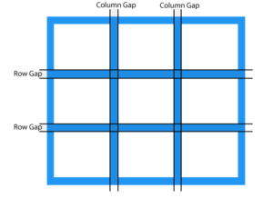
The default size of the gap is 0, which means that there are no spacing between grid items.
The size of the gap can be adjusted with the following properties:
column-gap– Specifies the gap between grid columnsrow-gap– Specifies the gap between grid rowsgap– Shorthand property forrow-gapandcolumn-gap
The CSS column-gap Property
The column-gap property specifies the gap between the columns in a grid.
Example:
|
1 2 3 4 5 6 7 8 9 10 11 12 13 14 15 16 17 18 19 20 21 22 23 24 25 26 27 28 29 30 31 32 33 34 35 36 37 |
<!DOCTYPE html> <html> <head> <style> .container { display: grid; column-gap: 50px; grid-template-columns: auto auto auto; background-color: dodgerblue; padding: 10px; } .container div { background-color: #f1f1f1; border: 1px solid black; padding: 20px; font-size: 30px; text-align: center; } </style> </head> <body> <h1>The column-gap Property</h1> <p>Use the <em>column-gap</em> property to adjust the space between the grid columns:</p> <div class="container"> <div>1</div> <div>2</div> <div>3</div> <div>4</div> <div>5</div> </div> </body> </html> |
Result:
The CSS row-gap Property
The row-gap property specifies the gap between the rows in a grid.
Example:
|
1 2 3 4 5 6 7 8 9 10 11 12 13 14 15 16 17 18 19 20 21 22 23 24 25 26 27 28 29 30 31 32 33 34 35 36 37 |
<!DOCTYPE html> <html> <head> <style> .container { display: grid; row-gap: 50px; grid-template-columns: auto auto auto; background-color: dodgerblue; padding: 10px; } .container div { background-color: #f1f1f1; border: 1px solid black; padding: 20px; font-size: 30px; text-align: center; } </style> </head> <body> <h1>The row-gap Property</h1> <p>Use the <em>row-gap</em> property to adjust the space between the grid rows:</p> <div class="container"> <div>1</div> <div>2</div> <div>3</div> <div>4</div> <div>5</div> </div> </body> </html> |
Result:
The CSS gap Property
The gap property is a shorthand property for row-gap and column-gap.
If a single value is provided, it applies the same gap to both rows and columns.
If two values are provided, the first value sets the row-gap, and the second value sets the column-gap.
Example:
|
1 2 3 4 5 6 7 8 9 10 11 12 13 14 15 16 17 18 19 20 21 22 23 24 25 26 27 28 29 30 31 32 33 34 35 36 37 |
<!DOCTYPE html> <html> <head> <style> .container { display: grid; gap: 50px; grid-template-columns: auto auto auto; background-color: dodgerblue; padding: 10px; } .container div { background-color: #f1f1f1; border: 1px solid black; padding: 20px; font-size: 30px; text-align: center; } </style> </head> <body> <h1>The gap Property</h1> <p>Use the <em>gap</em> shorthand property to adjust the space between the columns and rows:</p> <div class="container"> <div>1</div> <div>2</div> <div>3</div> <div>4</div> <div>5</div> </div> </body> </html> |
Result:
Using two values – Set gap between rows to 30px, and gap between columns to 100px:
Example:
|
1 2 3 4 5 6 7 8 9 10 11 12 13 14 15 16 17 18 19 20 21 22 23 24 25 26 27 28 29 30 31 32 33 34 35 36 37 |
<!DOCTYPE html> <html> <head> <style> .container { display: grid; gap: 30px 100px; grid-template-columns: auto auto auto; background-color: dodgerblue; padding: 10px; } .container div { background-color: #f1f1f1; border: 1px solid black; padding: 20px; font-size: 30px; text-align: center; } </style> </head> <body> <h1>The gap Property</h1> <p>Use the <em>gap</em> shorthand property to adjust the space between the columns and rows.</p> <div class="container"> <div>1</div> <div>2</div> <div>3</div> <div>4</div> <div>5</div> </div> </body> </html> |
Result:
CSS Grid Container – Align Grid Content
Inside the grid container you can define the alignment of the grid content with the following properties:
justify-content– Aligns the grid content when it does not use all available space on the main-axis (horizontally)align-content– Aligns the grid content when it does not use all available space on the cross-axis (vertically)place-content– Shorthand property foralign-contentandjustify-content
The CSS justify-content Property
The justify-content property is used to align the grid content when it does not use all available space on the main-axis (horizontally).
This property can have one of the following values:
space-evenlyspace-aroundspace-betweencenterstartend
Example:
|
1 2 3 4 5 6 7 8 9 10 11 12 13 14 15 16 17 18 19 20 21 22 23 24 25 26 27 28 29 30 31 32 33 34 35 36 37 38 39 40 41 |
<!DOCTYPE html> <html> <head> <style> .container { display: grid; grid-template-columns: 70px 70px 70px; background-color: dodgerblue; padding: 5px; gap: 5px; justify-content: space-evenly; } .container div { background-color: #f1f1f1; color:#000; padding: 10px; font-size: 30px; text-align: center; } </style> </head> <body> <h1>justify-content: space-evenly</h1> <p>Use the <em>justify-content</em> property to align the grid items inside the container.</p> <p>The value "space-evenly" displays the grid items with equal space around them:</p> <div class="container"> <div>1</div> <div>2</div> <div>3</div> <div>4</div> <div>5</div> <div>6</div> </div> </body> </html> |
Result:
The space-around value displays the grid items with space around them:
Example:
|
1 2 3 4 5 6 7 8 9 10 11 12 13 14 15 16 17 18 19 20 21 22 23 24 25 26 27 28 29 30 31 32 33 34 35 36 37 38 39 40 41 |
<!DOCTYPE html> <html> <head> <style> .container { display: grid; grid-template-columns: 70px 70px 70px; background-color: dodgerblue; padding: 5px; gap: 5px; justify-content: space-around; } .container div { background-color: #f1f1f1; color:#000; padding: 10px; font-size: 30px; text-align: center; } </style> </head> <body> <h1>justify-content: space-around</h1> <p>Use the <em>justify-content</em> property to align the grid items inside the container.</p> <p>The value "space-around" displays the grid items with space around them:</p> <div class="container"> <div>1</div> <div>2</div> <div>3</div> <div>4</div> <div>5</div> <div>6</div> </div> </body> </html> |
Result:
The space-between value displays the grid items with space between them:
Example:
|
1 2 3 4 5 6 7 8 9 10 11 12 13 14 15 16 17 18 19 20 21 22 23 24 25 26 27 28 29 30 31 32 33 34 35 36 37 38 39 40 41 |
<!DOCTYPE html> <html> <head> <style> .container { display: grid; grid-template-columns: 70px 70px 70px; background-color: dodgerblue; padding: 5px; gap: 5px; justify-content: space-between; } .container div { background-color: #f1f1f1; color:#000; padding: 10px; font-size: 30px; text-align: center; } </style> </head> <body> <h1>justify-content: space-between</h1> <p>Use the <em>justify-content</em> property to align the grid items inside the container.</p> <p>The value "space-between" displays the grid items with space between them:</p> <div class="container"> <div>1</div> <div>2</div> <div>3</div> <div>4</div> <div>5</div> <div>6</div> </div> </body> </html> |
Result:
The center value positions the grid items in the center of the container:
Example:
|
1 2 3 4 5 6 7 8 9 10 11 12 13 14 15 16 17 18 19 20 21 22 23 24 25 26 27 28 29 30 31 32 33 34 35 36 37 38 39 40 41 |
<!DOCTYPE html> <html> <head> <style> .container { display: grid; grid-template-columns: 70px 70px 70px; background-color: dodgerblue; padding: 5px; gap: 5px; justify-content: center; } .container div { background-color: #f1f1f1; color:#000; padding: 10px; font-size: 30px; text-align: center; } </style> </head> <body> <h1>justify-content: center</h1> <p>Use the <em>justify-content</em> property to align the grid items inside the container.</p> <p>The value "center" positions the grid items in the center of the container:</p> <div class="container"> <div>1</div> <div>2</div> <div>3</div> <div>4</div> <div>5</div> <div>6</div> </div> </body> </html> |
Result:
The start value positions the grid items at the start of the container:
Example:
|
1 2 3 4 5 6 7 8 9 10 11 12 13 14 15 16 17 18 19 20 21 22 23 24 25 26 27 28 29 30 31 32 33 34 35 36 37 38 39 40 41 |
<!DOCTYPE html> <html> <head> <style> .container { display: grid; grid-template-columns: 70px 70px 70px; background-color: dodgerblue; padding: 5px; gap: 5px; justify-content: start; } .container div { background-color: #f1f1f1; color:#000; padding: 10px; font-size: 30px; text-align: center; } </style> </head> <body> <h1>justify-content: start</h1> <p>Use the <em>justify-content</em> property to align the grid items inside the container.</p> <p>The value "start" positions the grid items at the start of the container:</p> <div class="container"> <div>1</div> <div>2</div> <div>3</div> <div>4</div> <div>5</div> <div>6</div> </div> </body> </html> |
Result:
The end value positions the grid items at the end of the container:
Example:
|
1 2 3 4 5 6 7 8 9 10 11 12 13 14 15 16 17 18 19 20 21 22 23 24 25 26 27 28 29 30 31 32 33 34 35 36 37 38 39 40 41 |
<!DOCTYPE html> <html> <head> <style> .container { display: grid; grid-template-columns: 70px 70px 70px; background-color: dodgerblue; padding: 5px; gap: 5px; justify-content: end; } .container div { background-color: #f1f1f1; color:#000; padding: 10px; font-size: 30px; text-align: center; } </style> </head> <body> <h1>justify-content: end</h1> <p>Use the <em>justify-content</em> property to align the grid items inside the container.</p> <p>The value "end" positions the grid items at the end of the container:</p> <div class="container"> <div>1</div> <div>2</div> <div>3</div> <div>4</div> <div>5</div> <div>6</div> </div> </body> </html> |
Result:
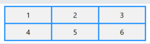
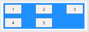
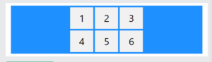
CSS Grid Items
A grid container contains one or more grid items.
All direct child elements of a grid container automatically become grid items.
Below is a grid container with five grid items:
Example:
|
1 2 3 4 5 6 7 8 9 10 11 12 13 14 15 16 17 18 19 20 21 22 23 24 25 26 27 28 29 30 31 32 33 34 35 36 37 38 |
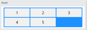
<!DOCTYPE html> <html> <head> <style> .container { display: grid; grid-template-columns: auto auto auto; background-color: dodgerblue; padding: 5px; gap: 5px; } .container div { background-color: #f1f1f1; color: #000; padding: 10px; font-size: 30px; text-align: center; } </style> </head> <body> <h1>Grid Items</h1> <p>A grid container contains one or more grid items arranged in columns and rows.</p> <p>All direct child elements of a grid container automatically become grid items.</p> <div class="container"> <div>1</div> <div>2</div> <div>3</div> <div>4</div> <div>5</div> </div> </body> </html> |
Result:
CSS Sizing/Spanning Grid Items
A grid item can span over mulitiple columns or rows.
We can specify where to start and end a grid item by using the following properties:
grid-column-start– Specifies on which column-line the grid item will startgrid-column-end– Specifies on which column-line the grid item will endgrid-column– Shorthand property forgrid-column-startandgrid-column-endgrid-row-start– Specifies on which row-line the grid item will startgrid-row-end– Specifies on which row-line the grid item will endgrid-row– Shorthand property forgrid-row-startandgrid-row-end
The lines between the columns in a grid are called column-lines, and the lines between the rows in a grid are called row-lines.
We can refer to line numbers when placing a grid item in a grid container.
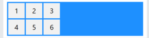
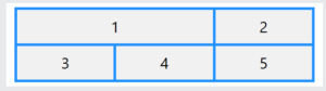
CSS grid-column-start and grid-column-end
The grid-column-start property specifies on which column-line the grid item will start.
The grid-column-end property specifies on which column-line the grid item will end.
Example:
|
1 2 3 4 5 6 7 8 9 10 11 12 13 14 15 16 17 18 19 20 21 22 23 24 25 26 27 28 29 30 31 32 33 34 35 36 37 38 39 40 41 |
<!DOCTYPE html> <html> <head> <style> .container { display: grid; grid-template-columns: auto auto auto; gap: 5px; background-color: dodgerblue; padding: 5px; } .container div { background-color: #f1f1f1; text-align: center; padding: 10px; font-size: 30px; } .item1 { grid-column-start: 1; grid-column-end: 3; } </style> </head> <body> <h1>The grid-column-start and grid-column-end Properties</h1> <p>Let the first grid item start at column-line 1, and end on column-line 3:</p> <div class="container"> <div class="item1">1</div> <div class="item2">2</div> <div class="item3">3</div> <div class="item4">4</div> <div class="item5">5</div> </div> </body> </html> |
Result:
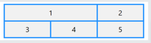
The CSS grid-column Property
The grid-column property is a shorthand property for the grid-column-start and the grid-column-end properties.
Example:
|
1 2 3 4 5 6 7 8 9 10 11 12 13 14 15 16 17 18 19 20 21 22 23 24 25 26 27 28 29 30 31 32 33 34 35 36 37 38 39 40 |
<!DOCTYPE html> <html> <head> <style> .container { display: grid; grid-template-columns: auto auto auto; gap: 5px; background-color: dodgerblue; padding: 5px; } .container div { background-color: #f1f1f1; text-align: center; padding: 10px; font-size: 30px; } .item1 { grid-column: 1 / span 2; } </style> </head> <body> <h1>The grid-column Property</h1> <p>Let the first grid item start at column-line 1, and let it span 2 columns:</p> <div class="container"> <div class="item1">1</div> <div class="item2">2</div> <div class="item3">3</div> <div class="item4">4</div> <div class="item5">5</div> </div> </body> </html> |
Result:
CSS grid-row-start and grid-row-end
The grid-row-start property specifies on which row-line the grid item will start.
The grid-row-end property specifies on which row-line the grid item will end.
Example:
|
1 2 3 4 5 6 7 8 9 10 11 12 13 14 15 16 17 18 19 20 21 22 23 24 25 26 27 28 29 30 31 32 33 34 35 36 37 38 39 40 41 |
<!DOCTYPE html> <html> <head> <style> .container { display: grid; grid-template-columns: auto auto auto; gap: 5px; background-color: dodgerblue; padding: 5px; } .container div { background-color: #f1f1f1; text-align: center; padding: 10px; font-size: 30px; } .item1 { grid-row-start: 1; grid-row-end: 3; } </style> </head> <body> <h1>The grid-row-start and grid-row-end Properties</h1> <p>Let the first grid item start at row-line 1, and end on row-line 3:</p> <div class="container"> <div class="item1">1</div> <div class="item2">2</div> <div class="item3">3</div> <div class="item4">4</div> <div class="item5">5</div> </div> </body> </html> |
Result:
The CSS grid-row Property
The grid-row property is a shorthand property for the grid-row-start and the grid-row-end properties.
Example:
|
1 2 3 4 5 6 7 8 9 10 11 12 13 14 15 16 17 18 19 20 21 22 23 24 25 26 27 28 29 30 31 32 33 34 35 36 37 38 39 40 |
<!DOCTYPE html> <html> <head> <style> .container { display: grid; grid-template-columns: auto auto auto; gap: 5px; background-color: dodgerblue; padding: 5px; } .container div { background-color: #f1f1f1; text-align: center; padding: 10px; font-size: 30px; } .item1 { grid-row: 1 / span 2; } </style> </head> <body> <h1>The grid-row Property</h1> <p>Let the first grid item start at row-line 1, and let it span 2 rows:</p> <div class="container"> <div class="item1">1</div> <div class="item2">2</div> <div class="item3">3</div> <div class="item4">4</div> <div class="item5">5</div> </div> </body> </html> |
Result:
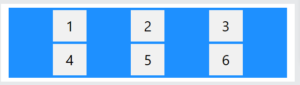
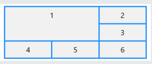
Combine grid-column and grid-row
Here we use both the grid-column and grid-row properties to let a grid item span both columns and rows.
Example:
|
1 2 3 4 5 6 7 8 9 10 11 12 13 14 15 16 17 18 19 20 21 22 23 24 25 26 27 28 29 30 31 32 33 34 35 36 37 38 39 40 41 42 |
<!DOCTYPE html> <html> <head> <style> .container { display: grid; grid-template-columns: auto auto auto; gap: 5px; background-color: dodgerblue; padding: 5px; } .container div { background-color: #f1f1f1; text-align: center; padding: 10px; font-size: 30px; } .item1 { grid-column: 1 / span 2; grid-row: 1 / span 2; } </style> </head> <body> <h1>Combine grid-column and grid-row</h1> <p>Let the first grid item start at column-line 1, and let it span 2 columns, also let the first grid item start at row-line 1, and let it span 2 rows:</p> <div class="container"> <div class="item1">1</div> <div class="item2">2</div> <div class="item3">3</div> <div class="item4">4</div> <div class="item5">5</div> <div class="item6">6</div> </div> </body> </html> |
Result:
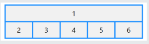
Naming Grid Items with grid-area
The CSS grid-template-areas is a grid container property, and it specifies areas within the grid layout.
You can name grid items by using the CSS grid-area property, and then reference to the name in the grid-template-areas property.
Each area is defined within apostrophes. The named grid items in each area is defined inside the apostrophes, separated by a space.
Example:
|
1 2 3 4 5 6 7 8 9 10 11 12 13 14 15 16 17 18 19 20 21 22 23 24 25 26 27 28 29 30 31 32 33 34 35 36 37 38 39 40 41 42 43 44 |
<!DOCTYPE html> <html> <head> <style> .container { display: grid; grid-template-areas: 'myHeader myHeader myHeader myHeader myHeader'; background-color: dodgerblue; padding: 5px; gap: 5px; } .container div { background-color: #f1f1f1; color:#000; padding: 10px; font-size: 30px; text-align: center; } .item1 { grid-area: myHeader; } </style> </head> <body> <h1>The grid-area Property</h1> <p>You can use the <em>grid-area</em> property to name grid items.</p> <p>Item1, is called "myHeader" and will take up the place of all five columns:</p> <div class="container"> <div class="item1">1</div> <div class="item2">2</div> <div class="item3">3</div> <div class="item4">4</div> <div class="item5">5</div> <div class="item6">6</div> </div> </body> </html> |
Result:
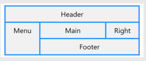
Make a ready-to-use Webpage Template
Here, we will name all grid items to make a ready-to-use webpage template:
Example:
|
1 2 3 4 5 6 7 8 9 10 11 12 13 14 15 16 17 18 19 20 21 22 23 24 25 26 27 28 29 30 31 32 33 34 35 36 37 38 39 40 41 42 43 44 45 46 47 48 |
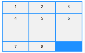
<!DOCTYPE html> <html> <head> <style> .container { display: grid; grid-template-areas: 'header header header header header header' 'menu main main main main right' 'menu footer footer footer footer footer'; background-color: dodgerblue; padding: 5px; gap: 5px; } .container div { background-color: #f1f1f1; color:#000; padding: 10px; font-size: 30px; text-align: center; } .item1 {grid-area: header;} .item2 {grid-area: menu;} .item3 {grid-area: main;} .item4 {grid-area: right;} .item5 {grid-area: footer;} </style> </head> <body> <h1>The grid-area Property</h1> <p>You can use the <em>grid-area</em> property to name grid items.</p> <p>This grid layout contains six columns and three rows:</p> <div class="container"> <div class="item1">Header</div> <div class="item2">Menu</div> <div class="item3">Main</div> <div class="item4">Right</div> <div class="item5">Footer</div> </div> </body> </html> |
Result:
CSS Grid Items – Alignment
Grid items can be aligned within their respective grid cells using properties like:
justify-self– Specifies the horizontal alignment within a cellalign-self– Specifies the vertical alignment within a cellplace-self– Shorthand property foralign-selfandjustify-self
These can also be applied to all grid items in a container using justify-items and align-items on the grid container.
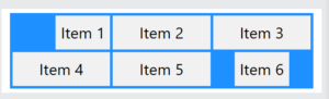
The CSS justify-self Property
The justify-self property is used to align a grid item within its grid cell in the inline direction.
Tip: For pages in English, inline direction is left to right and block direction is top to bottom.
This property can have one of the following values:
auto(default)normalstretchstartleftcenterendright
Note: For this property to have any alignment effect, the grid item need available space around itself in the inline direction.
|
1 2 3 4 5 6 7 8 9 10 11 12 13 14 15 16 17 18 19 20 21 22 23 24 25 26 27 28 29 30 31 32 33 34 35 36 37 38 39 40 41 |
<!DOCTYPE html> <html> <head> <style> .container { display: grid; grid-template-columns: auto auto auto; background-color: dodgerblue; padding: 5px; gap: 5px; } .container div { background-color: #f1f1f1; color:#000; padding: 10px; font-size: 30px; text-align: center; } .item1 {justify-self: right;} .item6 {justify-self: center;} </style> </head> <body> <h2>The justify-self property</h2> <p>The justify-self property is used to align a grid item within its grid cell in the inline direction.</p> <div class="container"> <div class="item1">1</div> <div class="item2">2</div> <div class="item3">3</div> <div class="item4">4</div> <div class="item5">5</div> <div class="item6">6</div> </div> </body> </html> |
Result:
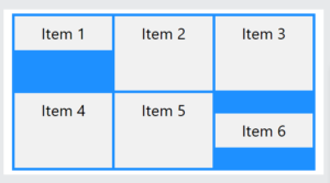
The CSS align-self Property
The align-self property is used to align a grid item within its grid cell in the block direction.
This property can have one of the following values:
auto(default)normalstretchstartendcenter
Note: For this property to have any alignment effect, the grid item need available space around itself in the block direction.
Example:
|
1 2 3 4 5 6 7 8 9 10 11 12 13 14 15 16 17 18 19 20 21 22 23 24 25 26 27 28 29 30 31 32 33 34 35 36 37 38 39 40 41 42 |
<!DOCTYPE html> <html> <head> <style> .container { display: grid; height: 300px; grid-template-columns: auto auto auto; background-color: dodgerblue; padding: 5px; gap: 5px; } .container div { background-color: #f1f1f1; color:#000; padding: 10px; font-size: 30px; text-align: center; } .item1 {align-self: start;} .item6 {align-self: center;} </style> </head> <body> <h2>The align-self property</h2> <p>The align-self property is used to align a grid item within its grid cell in the block direction.</p> <div class="container"> <div class="item1">Item 1</div> <div class="item2">Item 2</div> <div class="item3">Item 3</div> <div class="item4">Item 4</div> <div class="item5">Item 5</div> <div class="item6">Item 6</div> </div> </body> </html> |
Result:
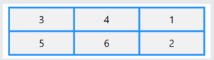
Set the Visual Order of the Grid Items
The CSS order property can be used to define the visual order of the grid items.
The first grid item in the HTML source code does not have to appear as the first item in the grid container.
Example:
|
1 2 3 4 5 6 7 8 9 10 11 12 13 14 15 16 17 18 19 20 21 22 23 24 25 26 27 28 29 30 31 32 33 34 35 36 37 38 39 40 41 42 43 44 45 |
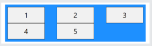
<!DOCTYPE html> <html> <head> <style> .container { display: grid; grid-template-columns: auto auto auto; gap: 5px; background-color: dodgerblue; padding: 5px; } .container div { background-color: #f1f1f1; text-align: center; padding: 10px; font-size: 30px; } .item1 {order: 3;} .item2 {order: 6;} .item3 {order: 1;} .item4 {order: 2;} .item5 {order: 4;} .item6 {order: 5;} </style> </head> <body> <h1>Visual Order of the Grid Items</h1> <p>The grid items do not have to be displayed in the same order as they are written in the HTML source code.</p> <p>The CSS order property can be used to define the visual order of the grid items.</p> <div class="container"> <div class="item1">1</div> <div class="item2">2</div> <div class="item3">3</div> <div class="item4">4</div> <div class="item5">5</div> <div class="item6">6</div> </div> </body> </html> |
Result:
CSS 12-Column Grid Layout
A 12-column grid is a common and flexible method for structuring web page content, particularly for responsive web design.
The 12-column grid system divides the available horizontal space into 12 equal-width columns, allowing for precise placement and sizing of elements within the layout.
Benefits of a 12-Column Grid
- Flexibility: The number 12 is highly divisible. Designers can easily create designs with halves, thirds, and quarters (2 columns of 6, 3 columns of 4, 4 columns of 3).
- Responsiveness: A 12-column grid is ideal for building responsive websites that adapt to different screen sizes (desktop, tablet, or mobile) with mediaqueries. This provides a consistent user experience across all platforms.
- Efficiency: Having a pre-defined structure speeds up the design process.
Here is how to create a basic 12-column CSS Grid layout:
Define the Grid Container
Apply display: grid; to the grid container.
Create the 12 Columns
Use the grid-template-columns property to define the 12 columns.
The code repeat(12, [col-start] 1fr); creates a 12-column grid with equal-width, and names the start line of each column track col-start.
repeat(12,..): Tells the grid to repeat the following track definition 12 times, resulting in 12 columns.[col-start]: This creates a named grid line. Because it is repeated 12 times, you will have 12 lines named col-start. This is useful for placing grid items at specific start points within the grid.1fr: A fractional unit that represents one fraction of the total available space in the grid container. By using 1fr, each of the 12 columns will be an equal, fluid width.
Place the Grid Items
Grid items can then be placed and sized across these 12 columns using grid-column.
- To make a grid item span a certain number of columns, use
grid-column: span <number>;orgrid-column: <start-line> / span <number>;. - You can also define the start and end grid lines for an item using
grid-column: <start-line> / <end-line>;.
Use Mediaqueries to Add Breakpoints
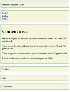
Always design for mobile first: Here we display the sections in the source order (from top to bottom) for screens less than 576 pixels wide.
Then, we go to a two-column layout for screens between 576 and 767 pixels wide.
Then, we go to a three-column layout for screens over 767 pixels wide.
complete example of a 12-column grid layout:
|
1 2 3 4 5 6 7 8 9 10 11 12 13 14 15 16 17 18 19 20 21 22 23 24 25 26 27 28 29 30 31 32 33 34 35 36 37 38 39 40 41 42 43 44 45 46 47 48 49 50 51 52 53 54 55 56 57 58 59 60 61 62 63 64 65 66 67 68 69 70 71 72 73 74 75 76 77 78 79 80 81 82 83 84 85 86 87 88 89 90 91 92 93 94 95 96 97 |
<!DOCTYPE html> <html> <head> <title>Page Title</title> <meta charset="UTF-8"> <meta name="viewport" content="width=device-width, initial-scale=1"> <style> * { box-sizing: border-box; } .container { display: grid; grid-template-columns: repeat(12, [col-start] 1fr); gap: 20px; } nav ul { list-style: none; margin: 0; padding: 0; } /* Mobile first */ .container > * { border: 1px solid green; background-color: beige; padding: 10px; grid-column: col-start / span 12; } @media (min-width: 576px) { .sidebar { grid-column: col-start / span 3; grid-row: 3; } .ads { grid-column: col-start / span 3; } .content, .footer { grid-column: col-start 4 / span 9; } nav ul { display: flex; justify-content: space-between; } } @media (min-width: 768px) { .nav { grid-column: col-start / span 2; grid-row: 2 / 4; } .content { grid-column: col-start 3 / span 8; grid-row: 2 / 4; } .sidebar { grid-column: col-start 11 / span 2; } .ads { grid-column: col-start 11 / span 2; } .footer { grid-column: col-start / span 12; } nav ul { flex-direction: column; } } </style> </head> <body> <div class="container"> <header class="head">Header/Company Logo</header> <nav class="nav"> <ul> <li><a href="#">Link 1</a></li> <li><a href="#">Link 2</a></li> <li><a href="#">Link 3</a></li> </ul> </nav> <div class="content"> <h1>Content area</h1> <p>Here we display the sections in source order for screens less than 576 pixels wide.</p> <p>Then, we go to a two column layout for screens between 576 and 767 pixels wide.</p> <p>Then, we go to a three column layout for screens over 767 pixels wide.</p> <p>Resize the browser window to see the responsive effect.</p> </div> <div class="sidebar">Sidebar</div> <div class="ads">Ads</div> <footer class="footer">The footer</footer> </div> </body> </html> |
Result: