CSS Flexbox (Flexible Box Layout)
CSS Flexbox is short for the CSS Flexible Box Layout module.
Flexbox is a layout model for arranging items (horizontally or vertically) within a container, in a flexible and responsive way.
Flexbox makes it easy to design a flexible and responsive layout, without using float or positioning.
|
1 2 3 4 5 6 7 8 9 10 11 12 13 14 15 16 17 18 19 20 21 22 23 24 25 26 27 |
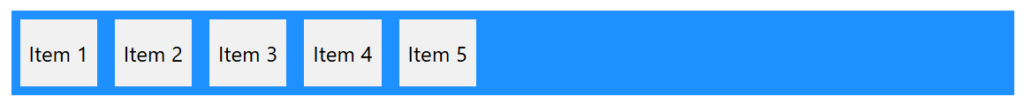
<!DOCTYPE html> <html> <head> <style> .container { display: flex; background-color: DodgerBlue; } .container div { background-color: #f1f1f1; margin: 10px; padding: 20px; font-size: 24px; } </style> </head> <body> <div class="container"> <div>Item 1</div> <div>Item 2</div> <div>Item 3</div> <div>Item 4</div> <div>Item 5</div> </div> </body> </html> |
CSS Flex Container Properties
The flex container element can have the following properties:
display– Must be set toflexorinline-flexflex-direction– Sets the display-direction of flex itemsflex-wrap– Specifies whether the flex items should wrap or notflex-flow– Shorthand property forflex-directionandflex-wrapjustify-content– Aligns the flex items when they do not use all available space on the main-axis (horizontally)align-items– Aligns the flex items when they do not use all available space on the cross-axis (vertically)align-content– Aligns the flex lines when there is extra space in the cross axis and flex items wrap
CSS flex-direction Property
The flex-direction property specifies the display-direction of flex items in the flex container.
This property can have one of the following values:
row(default)columnrow-reversecolumn-reverse
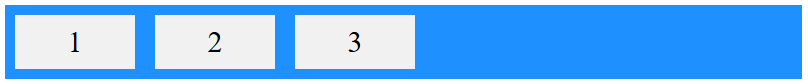
Example
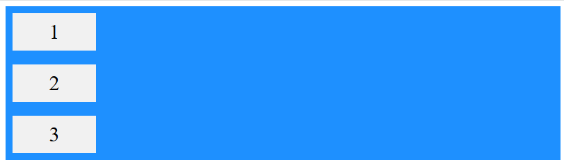
The row value is the default value, and it displays the flex items horizontally (from left to right):
|
1 2 3 4 5 6 7 8 9 10 11 12 13 14 15 16 17 18 19 20 21 22 23 24 25 26 27 28 29 30 |
<!DOCTYPE html> <html> <head> <style> .container { display: flex; flex-direction: row; background-color: DodgerBlue; } .container div { background-color: #f1f1f1; width: 100px; margin: 10px; padding: 10px; text-align: center; font-size: 30px; } </style> </head> <body> <div class="container"> <div>1</div> <div>2</div> <div>3</div> </div> </body> </html> |
Example
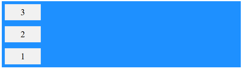
The column value displays the flex items vertically (from top to bottom):
|
1 2 3 4 5 6 7 8 9 10 11 12 13 14 15 16 17 18 19 20 21 22 23 24 25 26 27 28 29 |
<!DOCTYPE html> <html> <head> <style> .container { display: flex; flex-direction: column; background-color: DodgerBlue; } .container div { background-color: #f1f1f1; width: 100px; margin: 10px; padding: 10px; text-align: center; font-size: 30px; } </style> </head> <body> <div class="container"> <div>1</div> <div>2</div> <div>3</div> </div> </body> </html> |
Example
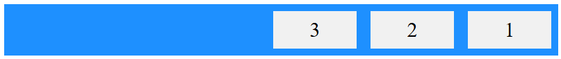
The row-reverse value displays the flex items horizontally (but from right to left):
|
1 2 3 4 5 6 7 8 9 10 11 12 13 14 15 16 17 18 19 20 21 22 23 24 25 26 27 28 29 30 |
<!DOCTYPE html> <html> <head> <style> .container { display: flex; flex-direction: row-reverse; background-color: DodgerBlue; } .container div { background-color: #f1f1f1; width: 100px; margin: 10px; padding: 10px; text-align: center; font-size: 30px; } </style> </head> <body> <div class="container"> <div>1</div> <div>2</div> <div>3</div> </div> </body> </html> |
Example
The column-reverse value displays the flex items vertically (but from bottom to top):
|
1 2 3 4 5 6 7 8 9 10 11 12 13 14 15 16 17 18 19 20 21 22 23 24 25 26 27 28 29 30 |
<!DOCTYPE html> <html> <head> <style> .container { display: flex; flex-direction: column-reverse; background-color: DodgerBlue; } .container div { background-color: #f1f1f1; width: 100px; margin: 10px; padding: 10px; text-align: center; font-size: 30px; } </style> </head> <body> <div class="container"> <div>1</div> <div>2</div> <div>3</div> </div> </body> </html> |
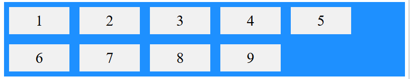
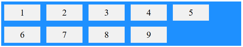
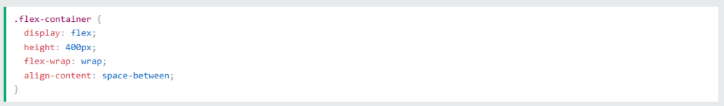
CSS flex-wrap Property
The flex-wrap property specifies whether the flex items should wrap or not, if there is not enough room for them on one flex line.
This property can have one of the following values:
nowrap(default)wrapwrap-reverse
Example
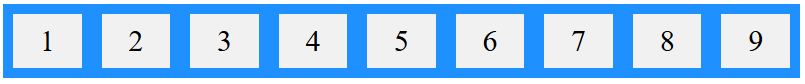
The nowrap value specifies that the flex items will not wrap (this is default):
|
1 2 3 4 5 6 7 8 9 10 11 12 13 14 15 16 17 18 19 20 21 22 23 24 25 26 27 28 29 30 31 32 33 34 35 |
<!DOCTYPE html> <html> <head> <style> .container { display: flex; flex-wrap: nowrap; background-color: DodgerBlue; } .container div { background-color: #f1f1f1; width: 100px; margin: 10px; padding: 10px; text-align: center; font-size: 30px; } </style> </head> <body> <div class="container"> <div>1</div> <div>2</div> <div>3</div> <div>4</div> <div>5</div> <div>6</div> <div>7</div> <div>8</div> <div>9</div> </div> </body> </html> |
Example
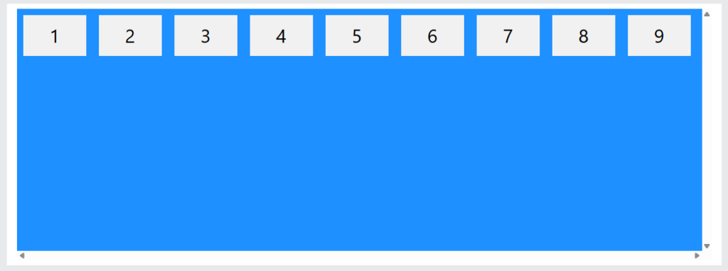
The wrap value specifies that the flex items will wrap if necessary:
|
1 2 3 4 5 6 7 8 9 10 11 12 13 14 15 16 17 18 19 20 21 22 23 24 25 26 27 28 29 30 31 32 33 34 |
<!DOCTYPE html> <html> <head> <style> .container { display: flex; flex-wrap: wrap; background-color: DodgerBlue; } .container div { background-color: #f1f1f1; width: 100px; margin: 10px; padding: 10px; text-align: center; font-size: 30px; } </style> </head> <body> <div class="container"> <div>1</div> <div>2</div> <div>3</div> <div>4</div> <div>5</div> <div>6</div> <div>7</div> <div>8</div> <div>9</div> </div> </body> </html> |
Example
The wrap-reverse value specifies that the flex items will wrap if necessary, in reverse order:
|
1 2 3 4 5 6 7 8 9 10 11 12 13 14 15 16 17 18 19 20 21 22 23 24 25 26 27 28 29 30 31 32 33 34 |
<!DOCTYPE html> <html> <head> <style> .container { display: flex; flex-wrap: wrap-reverse; background-color: DodgerBlue; } .container div { background-color: #f1f1f1; width: 100px; margin: 10px; padding: 10px; text-align: center; font-size: 30px; } </style> </head> <body> <div class="container"> <div>1</div> <div>2</div> <div>3</div> <div>4</div> <div>5</div> <div>6</div> <div>7</div> <div>8</div> <div>9</div> </div> </body> </html> |
CSS flex-flow Property
The flex-flow property is a shorthand property for setting both the flex-direction and flex-wrap properties.
Example
|
1 2 3 4 5 6 7 8 9 10 11 12 13 14 15 16 17 18 19 20 21 22 23 24 25 26 27 28 29 30 31 32 33 34 |
<!DOCTYPE html> <html> <head> <style> .container { display: flex; flex-flow: row wrap; background-color: DodgerBlue; } .container div { background-color: #f1f1f1; width: 100px; margin: 10px; padding: 10px; text-align: center; font-size: 30px; } </style> </head> <body> <div class="container"> <div>1</div> <div>2</div> <div>3</div> <div>4</div> <div>5</div> <div>6</div> <div>7</div> <div>8</div> <div>9</div> </div> </body> </html> |
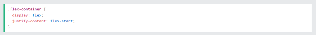
CSS justify-content Property
The justify-content property aligns the flex items along the main-axis (horizontally).
This property can have one of the following values:
centerflex-start(default)flex-endspace-aroundspace-betweenspace-evenly
Example
The center value aligns the flex items in the center of the container:
|
1 2 3 4 5 6 7 8 9 10 11 12 13 14 15 16 17 18 19 20 21 22 23 24 25 26 27 28 |
<!DOCTYPE html> <html> <head> <style> .container { display: flex; justify-content: center; background-color: DodgerBlue; } .container div { background-color: #f1f1f1; width: 100px; margin: 10px; padding: 10px; text-align: center; font-size: 30px; } </style> </head> <body> <div class="container"> <div>1</div> <div>2</div> <div>3</div> </div> </body> </html> |

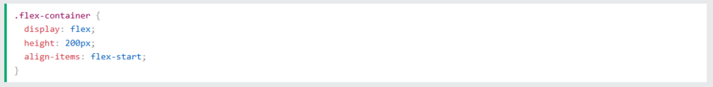
Example
The flex-start value aligns the flex items at the beginning of the container (this is default):
Result:

Example
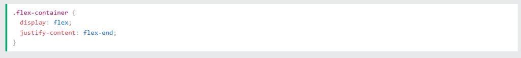
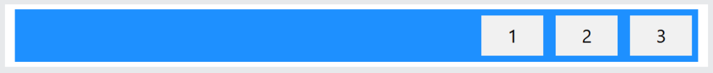
The flex-end value aligns the flex items at the end of the container:
Example
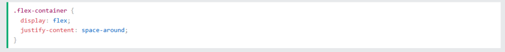
The space-around value displays the flex items with space before, between, and after the lines:
Result:

Example
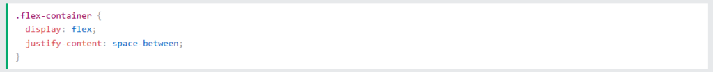
The space-between value displays the flex items with space between the lines:
Result:

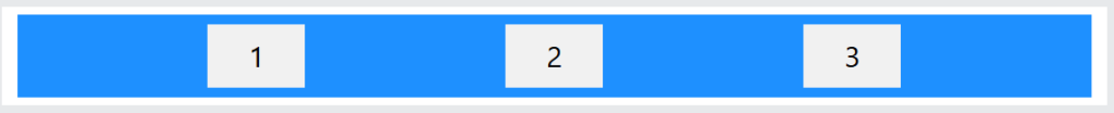
Example
The space-evenly value displays the flex items with equal space around them:
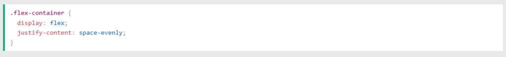
Result:
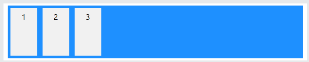
CSS align-items Property
The align-items property aligns the flex items vertically (on the cross-axis).
This property can have one of the following values:
normal(default)stretchcenterflex-startflex-endbaseline
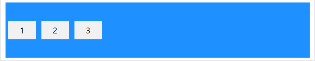
Example
The center value aligns the flex items in the middle of the container:
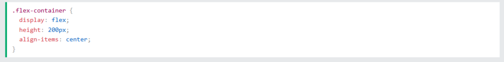
Result:
Example
The flex-start value aligns the flex items at the top of the container:
Result:
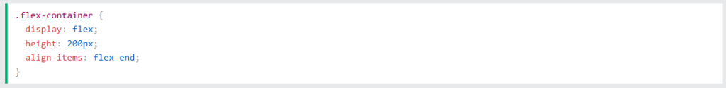
Example
The flex-end value aligns the flex items at the bottom of the container:
Example
The stretch value stretches the flex items to fill the container (this is equal to “normal” which is default):
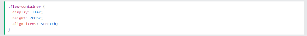
Result:
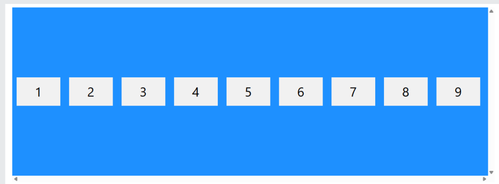
CSS align-content Property
The align-content property aligns the flex lines. It only has effect when flex items wrap onto multiple lines.
This property can have one of the following values:
stretch(default)centerflex-startflex-endspace-betweenspace-aroundspace-evenly
Example
With center, the flex lines are packed toward the center of the container:
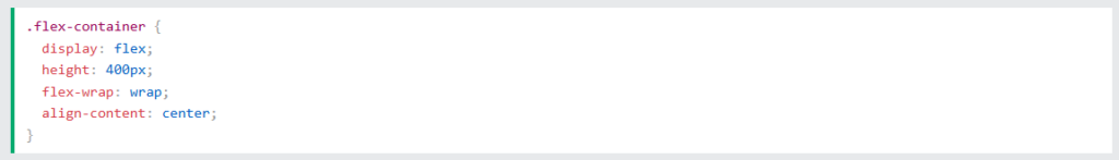
Result:
Example
With space-between, the space between the flex lines are equal:
Result:
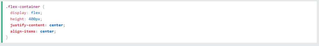
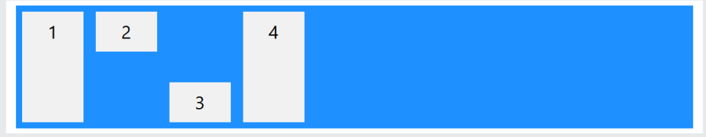
True Centering With Flexbox
The following example shows how to solve a common style problem: true centering.
To achieve true centering, set both the justify-content and the align-items properties to center for the flex container, and the flex item will be perfectly centered both horizontally and vertically:
Example
Result:

CSS Flex Items
The direct child elements of a flex container automatically becomes flex items.
Flex items can have the following properties:
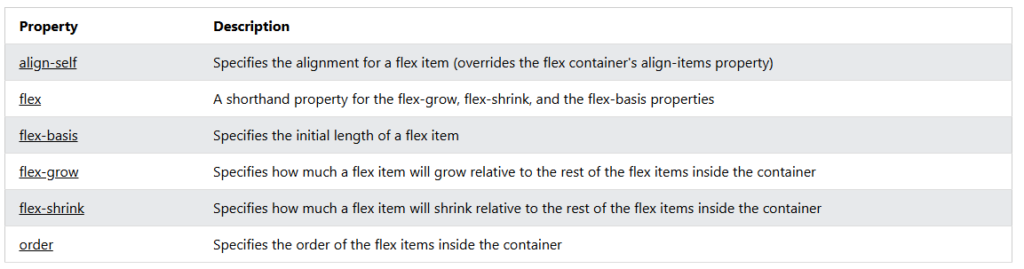
order– Specifies the display order of the flex items inside the flex containerflex-grow– Specifies how much a flex item will grow relative to the rest of the flex itemsflex-shrink– Specifies how much a flex item will shrink relative to the rest of the flex itemsflex-basis– Specifies the initial length of a flex itemflex– Shorthand property forflex-grow,flex-shrink, andflex-basisalign-self– Specifies the alignment for the flex item inside the flex container
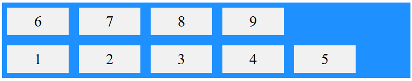
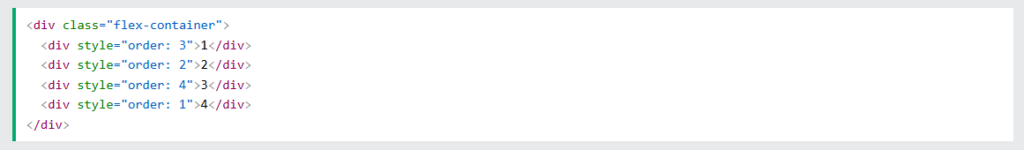
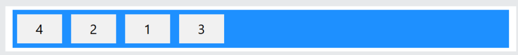
CSS order Property
The order property specifies the display order of the flex items inside the flex container.
The first flex item in the source code does not have to appear as the first item in the layout.
The order value must be a number, and the default value is 0.
Example
The order value specifies the display order of the flex items:
Result:
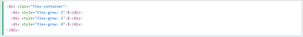
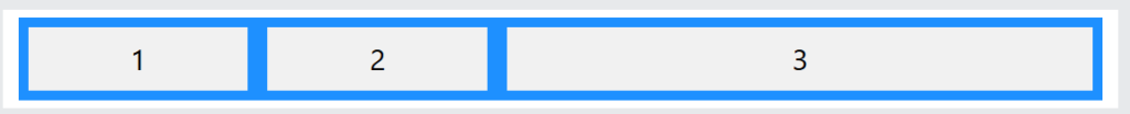
CSS flex-grow Property
The flex-grow property specifies how much a flex item will grow relative to the rest of the flex items.
The value must be a number, and the default value is 0.
Example
Make the third flex item grow four times faster than the other flex items:
Result:
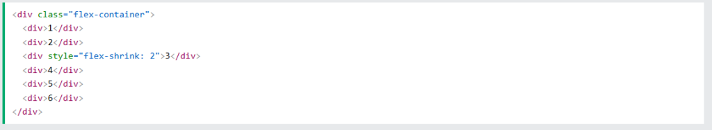
CSS flex-shrink Property
The flex-shrink property specifies how much a flex item will shrink relative to the rest of the flex items.
The value must be a number, and the default value is 1.
Example
Let the third flex item shrink twice as much as the other flex items:
Result:

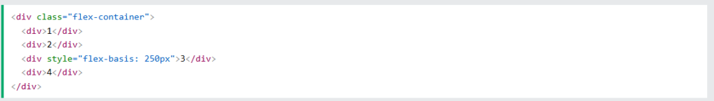
CSS flex-basis Property
The flex-basis property specifies the initial length of a flex item.
Example
Set the initial length of the third flex item to 250 pixels:

CSS flex Property
The flex property is a shorthand property for the flex-grow, flex-shrink, and flex-basis properties.
Example
Make the third flex item growable (1), not shrinkable (0), and with an initial length of 150 pixels:
|
1 2 3 4 5 6 7 8 9 10 11 12 13 14 15 16 17 18 19 20 21 22 23 24 25 26 27 28 29 30 |
<!DOCTYPE html> <html> <head> <style> .container { display: flex; background-color: dodgerblue; } .container div { background-color: #f1f1f1; color:#000; width: 100px; margin: 10px; padding: 10px; text-align: center; font-size: 30px; } </style> </head> <body> <div class="container"> <div>1</div> <div>2</div> <div style="flex: 1 0 150px">3</div> <div>4</div> </div> </body> </html> |

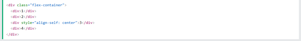
CSS align-self Property
The align-self property specifies the alignment for the selected item inside the flexible container.
This property overrides the default alignment set by the container’s align-items property.
In these examples we use a 200 pixels high container, to better demonstrate the align-self property:
Example
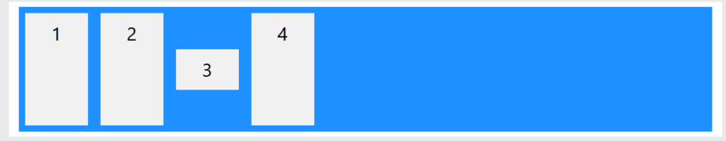
Align the third flex item in the middle of the container:
Result:
Example
Align the second flex item at the top of the container, and the third flex item at the bottom of the container:
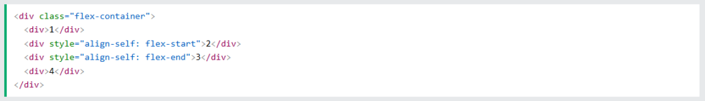
Result:
The CSS Flex Items Properties
The following table lists all the CSS Flex Items properties: