The CSS float Property
The float property specifies how an element should float within its container.
It places an element on the left or right side of its container, allowing text and inline elements to wrap around it.
The float property can have one of the following values:
left– The element floats to the left of its containerright– The element floats to the right of its containernone– Default. The element does not float and is displayed just where it occurs in the textinherit– The element inherits the float value of its parent
Tip: The float property is often used to wrap text around images!
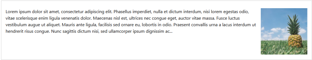
CSS float: right Example
The float: right value indicates that an element should float to the right within its container.
The following example specifies that the image should float to the right.
Tip: If you make the screen smaller, you will see that the text wraps around the image.
|
1 2 3 4 5 6 7 8 9 10 11 12 13 14 15 16 17 18 19 20 21 22 23 24 25 |
<!DOCTYPE html> <html> <head> <style> img { float: right; margin-left: 15px; width: 200px; height: 200px; } </style> </head> <body> <h2>CSS float: right</h2> <p>In this example, the image will float to the right in the div, and the text will wrap around the image.</p> <div> <img src="pineapple.jpg" alt="Pineapple" width="300" height="300"> Lorem ipsum dolor sit amet, consectetur adipiscing elit. Phasellus imperdiet, nulla et dictum interdum, nisi lorem egestas odio, vitae scelerisque enim ligula venenatis dolor. Maecenas nisl est, ultrices nec congue eget, auctor vitae massa. Fusce luctus vestibulum augue ut aliquet. Mauris ante ligula, facilisis sed ornare eu, lobortis in odio. Praesent convallis urna a lacus interdum ut hendrerit risus congue. Nunc sagittis dictum nisi, sed ullamcorper ipsum dignissim ac. In at libero sed nunc venenatis imperdiet sed ornare turpis. Donec vitae dui eget tellus gravida venenatis. Integer fringilla congue eros non fermentum. Sed dapibus pulvinar nibh tempor porta. Cras ac leo purus. Mauris quis diam velit. </div> </body> </html> |
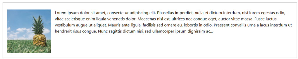
CSS float: left Example
The float: left value indicates that an element should float to the left within its container.
The following example specifies that the image should float to the left:
|
1 2 3 4 5 6 7 8 9 10 11 12 13 14 15 16 17 18 19 20 21 22 23 24 25 |
<!DOCTYPE html> <html> <head> <style> img { float: left; margin-right: 15px; width: 200px; height: 200px; } </style> </head> <body> <h2>CSS float: left</h2> <p>In this example, the image will float to the left in the div, and the text will wrap around the image.</p> <div> <img src="pineapple.jpg" alt="Pineapple" width="300" height="300"> Lorem ipsum dolor sit amet, consectetur adipiscing elit. Phasellus imperdiet, nulla et dictum interdum, nisi lorem egestas odio, vitae scelerisque enim ligula venenatis dolor. Maecenas nisl est, ultrices nec congue eget, auctor vitae massa. Fusce luctus vestibulum augue ut aliquet. Mauris ante ligula, facilisis sed ornare eu, lobortis in odio. Praesent convallis urna a lacus interdum ut hendrerit risus congue. Nunc sagittis dictum nisi, sed ullamcorper ipsum dignissim ac. In at libero sed nunc venenatis imperdiet sed ornare turpis. Donec vitae dui eget tellus gravida venenatis. Integer fringilla congue eros non fermentum. Sed dapibus pulvinar nibh tempor porta. Cras ac leo purus. Mauris quis diam velit. </div> </body> </html> |
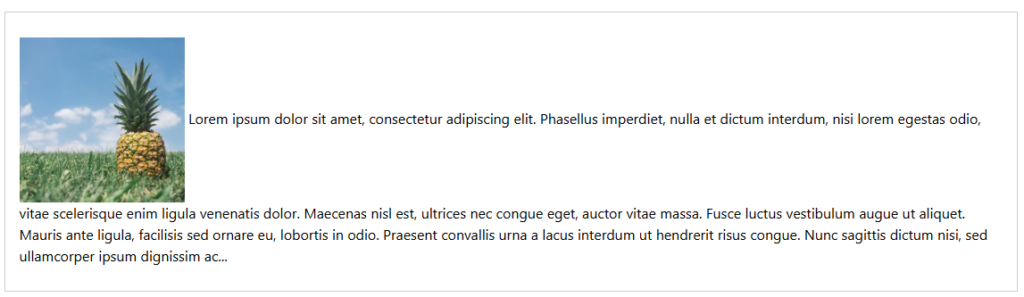
CSS float: none Example
The float: none value is the default value for float, and the element is displayed just where it occurs in its container.
In the following example the image will be displayed just where it occurs in the container:
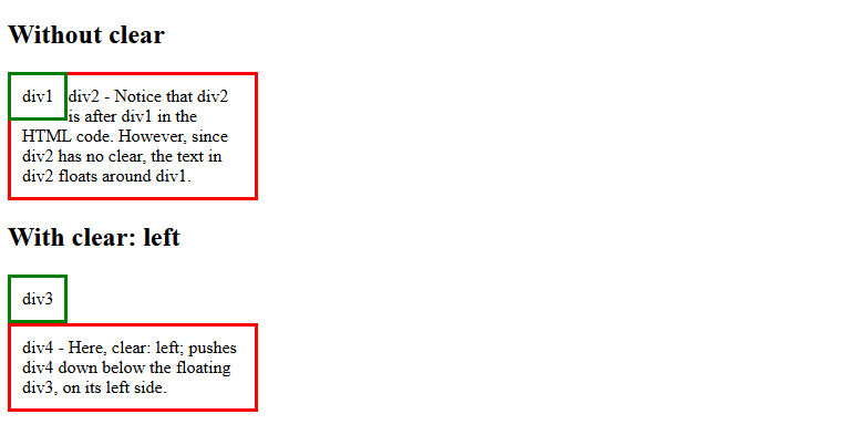
The CSS clear Property
The clear property specifies what should happen with the element that is NEXT to a floating element.
The clear property prevents elements from wrapping around or beside the floated content.
This property can have one of the following values:
none– Default. Allows elements to float on either sideleft– The element is pushed below floated elements on its left sideright– The element is pushed below floated elements, on its right sideboth– The element is pushed below floated elements, on both its left and right sideinherit– The element inherits the clear value from its parent
Example
Here, clear: left; pushes div2 down below the floating div1, on its left side:
|
1 2 3 4 5 6 7 8 9 10 11 12 13 14 15 16 17 18 19 20 21 22 23 24 25 26 27 28 29 30 31 32 33 34 35 36 37 38 39 40 41 42 |
<!DOCTYPE html> <html> <head> <style> .div1 { float: left; padding: 10px; border: 3px solid green; } .div2 { padding: 10px; border: 3px solid red; width: 200px; } .div3 { float: left; padding: 10px; border: 3px solid green; } .div4 { padding: 10px; border: 3px solid red; width: 200px; clear: left; } </style> </head> <body> <h2>Without clear</h2> <div class="div1">div1</div> <div class="div2">div2 - Notice that div2 is after div1 in the HTML code. However, since div2 has no clear, the text in div2 floats around div1.</div> <h2>With clear: left</h2> <div class="div3">div3</div> <div class="div4">div4 - Here, clear: left; pushes div4 down below the floating div3, on its left side.</div> </body> </html> |
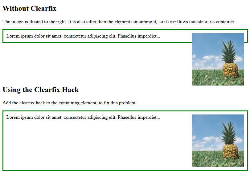
The CSS Clearfix Hack
If a floated element is taller than the containing element, it will “overflow” outside of its container. We can then add a clearfix hack to solve this problem:
|
1 2 3 4 5 6 7 8 9 10 11 12 13 14 15 16 17 18 19 20 21 22 23 24 25 26 27 28 29 30 31 32 33 34 35 36 37 38 39 40 41 42 43 44 45 |
<!DOCTYPE html> <html> <head> <style> div { border: 3px solid green; padding: 10px; } .img1 { float: right; } .img2 { float: right; } .clearfix::after { content: ""; clear: both; display: table; } </style> </head> <body> <h2>Without Clearfix</h2> <p>The image is floated to the right. It is also taller than the element containing it, so it overflows outside of its container:</p> <div> <img class="img1" src="pineapple.jpg" alt="Pineapple" width="170" height="170"> Lorem ipsum dolor sit amet, consectetur adipiscing elit. Phasellus imperdiet... </div> <h2 style="clear:right">Using the Clearfix Hack</h2> <p>Add the clearfix hack to the containing element, to fix this problem:</p> <div class="clearfix"> <img class="img2" src="pineapple.jpg" alt="Pineapple" width="170" height="170"> Lorem ipsum dolor sit amet, consectetur adipiscing elit. Phasellus imperdiet... </div> </body> </html> |
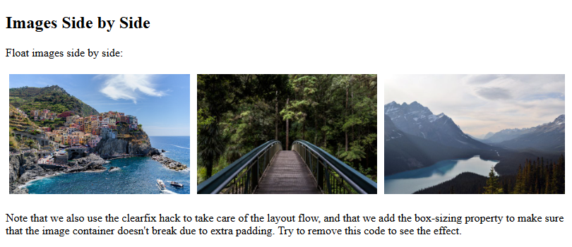
Images Side By Side
The grid of boxes can also be used to display images side by side:
|
1 2 3 4 5 6 7 8 9 10 11 12 13 14 15 16 17 18 19 20 21 22 23 24 25 26 27 28 29 30 31 32 33 34 35 36 37 38 39 40 41 42 |
<!DOCTYPE html> <html> <head> <style> * { box-sizing: border-box; } .img-container { float: left; width: 33.33%; padding: 5px; } .clearfix::after { content: ""; clear: both; display: table; } </style> </head> <body> <h2>Images Side by Side</h2> <p>Float images side by side:</p> <div class="clearfix"> <div class="img-container"> <img src="img_5terre.jpg" alt="Italy" style="width:100%"> </div> <div class="img-container"> <img src="img_forest.jpg" alt="Forest" style="width:100%"> </div> <div class="img-container"> <img src="img_mountains.jpg" alt="Mountains" style="width:100%"> </div> </div> <p>Note that we also use the clearfix hack to take care of the layout flow, and that we add the box-sizing property to make sure that the image container doesn't break due to extra padding. Try to remove this code to see the effect.</p> </body> </html> |
Navigation Menu
You can also use float with a list of hyperlinks to create a horizontal menu:
|
1 2 3 4 5 6 7 8 9 10 11 12 13 14 15 16 17 18 19 20 21 22 23 24 25 26 27 28 29 30 31 32 33 34 35 36 37 38 39 40 41 42 43 44 |
<!DOCTYPE html> <html> <head> <style> ul { list-style-type: none; margin: 0; padding: 0; overflow: hidden; background-color: #333; } li { float: left; } li a { display: inline-block; color: white; text-align: center; padding: 14px 16px; text-decoration: none; } li a:hover { background-color: #111; } .active { background-color: red; } </style> </head> <body> <ul> <li><a href="#home" class="active">Home</a></li> <li><a href="#news">News</a></li> <li><a href="#contact">Contact</a></li> <li><a href="#about">About</a></li> </ul> </body> </html> |
