Responsive Web Design
Introduction to Responsive Web Design
Responsive web design is about creating web pages that look good on all devices!
A responsive web design will automatically adjust for different screen sizes and viewports.
Best Experience For All Users
Web pages can be viewed with many different devices: desktops, tablets, and mobile phones.
Your web page should look good, and be easy to use, regardless of the device.
Responsive web design is about using HTML and CSS to automatically resize, hide, shrink, or enlarge a website, to make it look good on all devices.
Key components in responsive web design are:
- Viewport <meta> tag
- Flexible layout (grid and flex)
- Mediaqueries
Example:
|
1 2 3 4 5 6 7 8 9 10 11 12 13 14 15 16 17 18 19 20 21 22 23 24 25 26 27 28 29 30 31 32 33 34 35 36 37 38 39 40 41 42 43 44 45 46 47 48 49 50 51 52 53 54 55 56 57 58 59 60 61 62 63 64 65 66 67 68 69 70 71 72 73 74 75 76 77 78 79 80 81 82 83 84 85 86 87 88 89 90 91 92 93 94 95 96 97 98 99 100 101 102 103 104 105 106 107 108 109 110 111 112 113 114 115 116 117 118 119 120 121 122 123 124 125 126 127 128 129 130 131 132 133 134 135 136 137 138 139 140 141 142 143 144 145 146 |
<!DOCTYPE html> <html> <head> <meta name="viewport" content="width=device-width, initial-scale=1.0"> <style> * { box-sizing: border-box; } body { font-family: "Lucida Sans", sans-serif; font-size: 17px; } .grid-container { display: grid; grid-template-areas: 'header' 'menu' 'main' 'facts' 'footer'; background-color: white; gap: 10px; } .header { grid-area: header; background-color: purple; text-align: center; color: #ffffff; } .header > h1 { font-size: 40px; } .menu { grid-area: menu; } .menu ul { list-style-type: none; margin: 0; padding: 0; } .menu li { padding: 8px; margin-bottom: 7px; background-color: #33b5e5; color: #ffffff; } .menu li:hover { background-color: #0099cc; } .content { grid-area: main; } .content > h1 { font-size: 30px; margin-bottom: 7px; } .content > p { margin-bottom: 7px; } .facts { grid-area: facts; border: 1px solid #0099cc; background-color: beige; padding: 10px; } .facts > h2 { font-size: 20px; } .facts li { margin-bottom: 5px; } .footer { grid-area: footer; background-color: #0099cc; color: #ffffff; text-align: center; } @media (min-width: 600px) { .header {grid-area: 1 / span 6;} .menu {grid-area: 2 / span 1;} .content {grid-area: 2 / span 4;} .facts {grid-area: 3 / span 6;} .footer {grid-area: 4 / span 6;} } @media (min-width: 768px) { .header {grid-area: 1 / span 6;} .menu {grid-area: 2 / span 1;} .content {grid-area: 2 / span 4;} .facts {grid-area: 2 / span 1;} .footer {grid-area: 3 / span 6;} } </style> </head> <body> <div class="grid-container"> <div class="header"><h1>Chania</h1></div> <div class="menu"> <ul> <li>The Flight</li> <li>The City</li> <li>The Island</li> <li>The Food</li> </ul> </div> <div class="content"> <h1>The City</h1> <p>Chania is the capital of the Chania region on the island of Crete.</p> <p>The city can be divided in two parts, the old town and the modern city. The old town is situated next to the old harbour and is the matrix around which the whole urban area was developed.</p> <p>Chania lies along the north west coast of the island Crete.</p> </div> <div class="facts"> <h2>Facts:</h2> <ul> <li>Chania is a city on the island of Crete</li> <li>Crete is a Greek island in the Mediterranean Sea</li> </ul> </div> <div class="footer"><p>Resize the browser window to see the responsive effect.</p></div> </div> </body> </html> |
Result:
Responsive Web Design – The Viewport
Setting The Viewport
The viewport is the user’s visible area of a web page.
The viewport varies with the device (will be a lot smaller on a mobile phone than on a computer screen).
You should include the following <meta> element in the <head> section of all your web pages:
<meta name=”viewport” content=”width=device-width, initial-scale=1.0″>
This gives the browser instructions on how to control the page’s dimensions and scaling.
The width=device-width part sets the width of the page to follow the screen-width of the device (which will vary depending on the device).
The initial-scale=1.0 part sets the initial zoom level when the page is first loaded by the browser.
Here is an example of a web page without the viewport meta tag, and the same web page with the viewport meta tag:
Without the viewport meta tag
With the viewport meta tag
Responsive Web Design – Building a Grid View
What is a Grid-View?
Many web pages are based on a grid-view, which means that the page is divided into rows and columns.
A responsive grid-view often has 6 or 12 columns, and will shrink and expand as you resize the browser window.
Building a Grid View
Lets start building a grid-view.
First ensure that all HTML elements have the box-sizing property set to border-box. This makes sure that the padding and border are included in the total width and height of the elements.
Example:
|
1 2 3 4 5 6 7 8 9 10 11 12 13 14 15 16 17 18 19 20 21 22 23 24 25 26 27 28 29 30 31 32 33 34 35 36 37 38 39 40 41 42 43 44 45 46 47 48 49 50 51 52 53 54 55 56 57 58 59 60 61 62 63 64 65 66 67 68 69 70 71 72 73 74 75 76 77 78 79 80 81 82 83 84 85 86 87 88 89 90 91 92 93 94 95 96 97 98 99 100 101 102 103 104 105 106 107 108 109 110 111 112 113 114 115 116 117 118 119 120 121 122 123 124 125 126 127 128 129 130 |
<!DOCTYPE html> <html> <head> <meta name="viewport" content="width=device-width, initial-scale=1.0"> <style> * { box-sizing: border-box; } body { font-family: "Lucida Sans", sans-serif; font-size: 17px; } .grid-container { display: grid; grid-template-areas: 'header' 'menu' 'main' 'facts' 'footer'; background-color: white; gap: 10px; } .header { grid-area: header; background-color: purple; text-align: center; color: #ffffff; } .header > h1 { font-size: 40px; } .menu { grid-area: menu; } .menu ul { list-style-type: none; margin: 0; padding: 0; } .menu li { padding: 8px; margin-bottom: 7px; background-color: #33b5e5; color: #ffffff; } .menu li:hover { background-color: #0099cc; } .content { grid-area: main; } .content > h1 { font-size: 30px; margin-bottom: 7px; } .content > p { margin-bottom: 7px; } .facts { grid-area: facts; border: 1px solid #0099cc; background-color: beige; padding: 10px; } .facts > h2 { font-size: 20px; } .facts li { margin-bottom: 5px; } .footer { grid-area: footer; background-color: #0099cc; color: #ffffff; text-align: center; } </style> </head> <body> <div class="grid-container"> <div class="header"><h1>Chania</h1></div> <div class="menu"> <ul> <li>The Flight</li> <li>The City</li> <li>The Island</li> <li>The Food</li> </ul> </div> <div class="content"> <h1>The City</h1> <p>Chania is the capital of the Chania region on the island of Crete.</p> <p>The city can be divided in two parts, the old town and the modern city. The old town is situated next to the old harbour and is the matrix around which the whole urban area was developed.</p> <p>Chania lies along the north west coast of the island Crete.</p> </div> <div class="facts"> <h2>Facts:</h2> <ul> <li>Chania is a city on the island of Crete</li> <li>Crete is a Greek island in the Mediterranean Sea</li> </ul> </div> <div class="footer"><p>A footer.</p></div> </div> </body> </html> |
Result:
Responsive Web Design – Media Queries
CSS Media Queries
CSS media queries allow you to apply styles based on the characteristics of a device or the environment displaying the web page.
CSS media queries are essential for creating responsive web pages.
The CSS @media rule is used to add media queries to your style sheet.
Example
Here we use a media query to add a breakpoint at 600px:
|
1 2 3 4 5 6 7 8 9 10 11 12 13 14 15 16 17 18 19 20 21 22 23 24 25 26 27 28 29 30 31 32 33 34 35 36 37 38 39 40 41 42 43 44 45 46 47 48 49 50 51 52 53 54 55 56 57 58 59 60 61 62 63 64 65 66 67 68 69 70 71 72 73 74 75 76 77 78 79 80 81 82 83 84 85 86 87 88 89 90 91 92 93 94 95 96 97 98 99 100 101 102 103 104 105 106 107 108 109 110 111 112 113 114 115 116 117 118 119 120 121 122 123 124 125 126 127 128 129 130 131 132 133 134 135 136 137 138 |
<!DOCTYPE html> <html> <head> <meta name="viewport" content="width=device-width, initial-scale=1.0"> <style> * { box-sizing: border-box; } body { font-family: "Lucida Sans", sans-serif; font-size: 17px; } .grid-container { display: grid; grid-template-areas: 'header' 'menu' 'main' 'facts' 'footer'; background-color: white; gap: 10px; } .header { grid-area: header; background-color: purple; text-align: center; color: #ffffff; } .header > h1 { font-size: 40px; } .menu { grid-area: menu; } .menu ul { list-style-type: none; margin: 0; padding: 0; } .menu li { padding: 8px; margin-bottom: 7px; background-color: #33b5e5; color: #ffffff; } .menu li:hover { background-color: #0099cc; } .content { grid-area: main; } .content > h1 { font-size: 30px; margin-bottom: 7px; } .content > p { margin-bottom: 7px; } .facts { grid-area: facts; border: 1px solid #0099cc; background-color: beige; padding: 10px; } .facts > h2 { font-size: 20px; } .facts li { margin-bottom: 5px; } .footer { grid-area: footer; background-color: #0099cc; color: #ffffff; text-align: center; } @media (min-width: 600px) { .header {grid-area: 1 / span 6;} .menu {grid-area: 2 / span 1;} .content {grid-area: 2 / span 4;} .facts {grid-area: 2 / span 1;} .footer {grid-area: 3 / span 6;} } </style> </head> <body> <div class="grid-container"> <div class="header"><h1>Chania</h1></div> <div class="menu"> <ul> <li>The Flight</li> <li>The City</li> <li>The Island</li> <li>The Food</li> </ul> </div> <div class="content"> <h1>The City</h1> <p>Chania is the capital of the Chania region on the island of Crete.</p> <p>The city can be divided in two parts, the old town and the modern city. The old town is situated next to the old harbour and is the matrix around which the whole urban area was developed.</p> <p>Chania lies along the north west coast of the island Crete.</p> </div> <div class="facts"> <h2>Facts:</h2> <ul> <li>Chania is a city on the island of Crete</li> <li>Crete is a Greek island in the Mediterranean Sea</li> </ul> </div> <div class="footer"><p>Resize the browser window to see the responsive effect.</p></div> </div> </body> </html> |
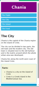
Result
Screen Width above 600px
Screen Width below 600px
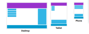
Typical Device Breakpoints
There are tons of screens and devices with different heights and widths, so it is hard to create an exact breakpoint for each device. To keep things simple you could target five groups:
|
1 2 3 4 5 6 7 8 9 10 11 12 13 14 |
/* Extra small devices (phones, 600px and down) */ @media only screen and (max-width: 600px) {...} /* Small devices (portrait tablets and large phones, 600px and up) */ @media only screen and (min-width: 600px) {...} /* Medium devices (landscape tablets, 768px and up) */ @media only screen and (min-width: 768px) {...} /* Large devices (laptops/desktops, 992px and up) */ @media only screen and (min-width: 992px) {...} /* Extra large devices (large laptops and desktops, 1200px and up) */ @media only screen and (min-width: 1200px) {...} |
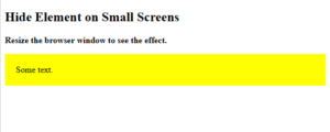
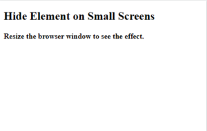
Hide Elements With Media Queries
Here, we use media queries to hide an element on small screens:
Example
|
1 2 3 4 5 6 7 8 9 10 11 12 13 14 15 16 17 18 19 20 21 22 23 24 25 26 27 28 |
<!DOCTYPE html> <html> <head> <meta name="viewport" content="width=device-width, initial-scale=1"> <style> #div1 { background-color: yellow; padding: 20px; } /* Hide element if the viewport width is 600px or less */ @media screen and (max-width: 600px) { #div1 { display: none; } } </style> </head> <body> <h2>Hide Element on Small Screens</h2> <p><strong>Resize the browser window to see the effect.</strong></p> <div id="div1">Some text.</div> </body> </html> |
Result
Screen Width above 600px
Screen Width below 600px
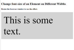
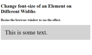
Change Font Size With Media Queries
Here, we use media queries to change the font size of an element on different viewport widths:
Exanple
|
1 2 3 4 5 6 7 8 9 10 11 12 13 14 15 16 17 18 19 20 21 22 23 24 25 26 27 28 29 |
<!DOCTYPE html> <html> <head> <meta name="viewport" content="width=device-width, initial-scale=1"> <style> #div1 { background-color: lightgrey; padding: 20px; font-size: 30px; } /* If viewport width is 600px or more, set font-size to 80px */ @media screen and (min-width: 600px) { #div1 { font-size: 80px; } } </style> </head> <body> <h2>Change font-size of an Element on Different Widths</h2> <p><strong>Resize the browser window to see the effect.</strong></p> <div id="div1">This is some text.</div> </body> </html> |
Result
Screen Width above 600px
Screen Width below 600px
Media Queries for User Preferences
Some users have motion sensitivity and prefer websites with less animation.
The prefers-reduced-motion media feature lets you check if a user has asked to reduce motion, such as animations or transitions. Use this feature to turn off animations and transitions for the users who has activated this setting on their computer:
Responsive Web Design – Images
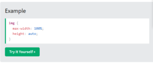
Using The width Property
If the width property is set to a percentage and the height property is set to “auto”, the image will be responsive and scale up and down:
Example
|
1 2 3 4 5 6 7 8 9 10 11 12 13 14 15 16 17 18 19 20 21 22 23 |
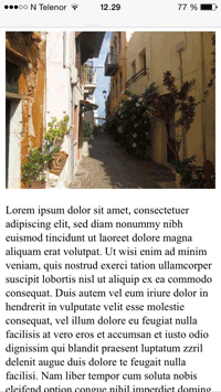
<!DOCTYPE html> <html> <head> <meta name="viewport" content="width=device-width, initial-scale=1.0"> <style> img { width: 100%; height: auto; } </style> </head> <body> <h1>Using width: 100%</h1> <p>If the width property is set to 100%, the image will scale up and down. It will even scale up to be larger than its original size.</p> <img src="img_chania.jpg" width="460" height="345"> <p>Resize the browser window to see the effect.</p> </body> </html> |
Result
Using width: 100%
If the width property is set to 100%, the image will scale up and down. It will even scale up to be larger than its original size.
Resize the browser window to see the effect.
Using The max-width Property
If the max-width property is set to 100%, the image will scale down if it has to, but never scale up to be larger than its original size:Example
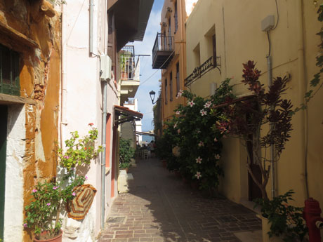
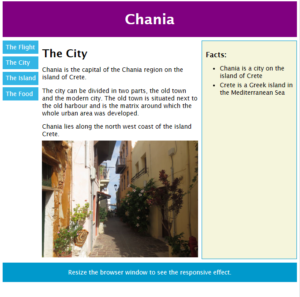
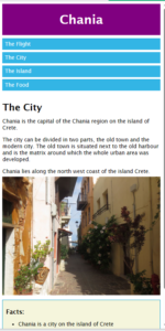
Add an Image to The Example Web Page
Example
|
1 2 3 4 5 6 7 8 9 10 11 12 13 14 15 16 17 18 19 20 21 22 23 24 25 26 27 28 29 30 31 32 33 34 35 36 37 38 39 40 41 42 43 44 45 46 47 48 49 50 51 52 53 54 55 56 57 58 59 60 61 62 63 64 65 66 67 68 69 70 71 72 73 74 75 76 77 78 79 80 81 82 83 84 85 86 87 88 89 90 91 92 93 94 95 96 97 98 99 100 101 102 103 104 105 106 107 108 109 110 111 112 113 114 115 116 117 118 119 120 121 122 123 124 125 126 127 128 129 130 131 132 133 134 135 136 137 138 139 140 141 142 143 144 145 146 147 148 149 150 151 152 |
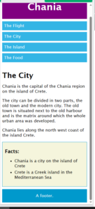
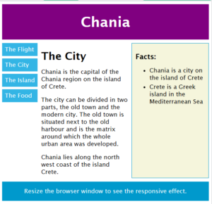
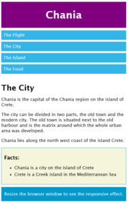
<!DOCTYPE html> <html> <head> <meta name="viewport" content="width=device-width, initial-scale=1.0"> <style> * { box-sizing: border-box; } body { font-family: "Lucida Sans", sans-serif; font-size: 17px; } img { width: 100%; height: auto; } .grid-container { display: grid; grid-template-areas: 'header' 'menu' 'main' 'facts' 'footer'; background-color: white; gap: 10px; } .header { grid-area: header; background-color: purple; text-align: center; color: #ffffff; } .header > h1 { font-size: 40px; } .menu { grid-area: menu; } .menu ul { list-style-type: none; margin: 0; padding: 0; } .menu li { padding: 8px; margin-bottom: 7px; background-color: #33b5e5; color: #ffffff; } .menu li:hover { background-color: #0099cc; } .content { grid-area: main; } .content > h1 { font-size: 30px; margin-bottom: 7px; } .content > p { margin-bottom: 7px; } .facts { grid-area: facts; border: 1px solid #0099cc; background-color: beige; padding: 10px; } .facts > h2 { font-size: 20px; } .facts li { margin-bottom: 5px; } .footer { grid-area: footer; background-color: #0099cc; color: #ffffff; text-align: center; } @media (min-width: 600px) { .header {grid-area: 1 / span 6;} .menu {grid-area: 2 / span 1;} .content {grid-area: 2 / span 4;} .facts {grid-area: 3 / span 6;} .footer {grid-area: 4 / span 6;} } @media (min-width: 768px) { .header {grid-area: 1 / span 6;} .menu {grid-area: 2 / span 1;} .content {grid-area: 2 / span 4;} .facts {grid-area: 2 / span 1;} .footer {grid-area: 3 / span 6;} } </style> </head> <body> <div class="grid-container"> <div class="header"><h1>Chania</h1></div> <div class="menu"> <ul> <li>The Flight</li> <li>The City</li> <li>The Island</li> <li>The Food</li> </ul> </div> <div class="content"> <h1>The City</h1> <p>Chania is the capital of the Chania region on the island of Crete.</p> <p>The city can be divided in two parts, the old town and the modern city. The old town is situated next to the old harbour and is the matrix around which the whole urban area was developed.</p> <p>Chania lies along the north west coast of the island Crete.</p> <img src="img_chania.jpg" width="460" height="345"> </div> <div class="facts"> <h2>Facts:</h2> <ul> <li>Chania is a city on the island of Crete</li> <li>Crete is a Greek island in the Mediterranean Sea</li> </ul> </div> <div class="footer"><p>Resize the browser window to see the responsive effect.</p></div> </div> </body> </html> |
Result
Screen Width above 600px
Screen Width below 600px
Background Images
Background images can also respond to resizing and scaling.
Here we will show three different methods:
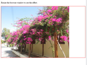
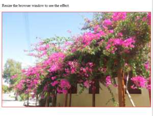
1. Using background-size: contain;: The background image will scale up and down, and tries to fit the content area. However, the image will keep its aspect ratio (the proportional relationship between the image’s width and height):
Example
|
1 2 3 4 5 6 7 8 9 10 11 12 13 14 15 16 17 18 19 20 21 22 23 |
<!DOCTYPE html> <html> <head> <meta name="viewport" content="width=device-width, initial-scale=1.0"> <style> div { width: 100%; height: 400px; background-image: url('img_flowers.jpg'); background-repeat: no-repeat; background-size: contain; border: 1px solid red; } </style> </head> <body> <p>Resize the browser window to see the effect.</p> <div></div> </body> </html> |
Result
Screen Width above 600px
Screen Width below 600px
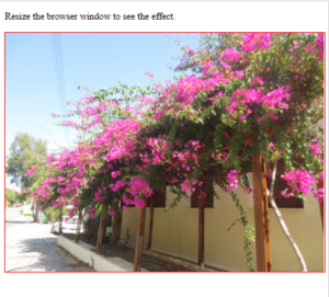
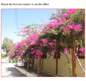
2. Using background-size: 100% 100%;: The background image will stretch to cover the entire content area:
Example
|
1 2 3 4 5 6 7 8 9 10 11 12 13 14 15 16 17 18 19 20 21 22 |
<!DOCTYPE html> <html> <head> <meta name="viewport" content="width=device-width, initial-scale=1.0"> <style> div { width: 100%; height: 400px; background-image: url('img_flowers.jpg'); background-size: 100% 100%; border: 1px solid red; } </style> </head> <body> <p>Resize the browser window to see the effect.</p> <div></div> </body> </html> |
Result
Screen Width above 600px
Screen Width below 600px
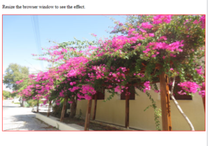
3. Using background-size: cover;: The background image will scale to cover the entire content area. Notice that the “cover” value keeps the aspect ratio, and some part of the background image may be clipped:
Example
|
1 2 3 4 5 6 7 8 9 10 11 12 13 14 15 16 17 18 19 20 21 22 |
<!DOCTYPE html> <html> <head> <meta name="viewport" content="width=device-width, initial-scale=1.0"> <style> div { width: 100%; height: 400px; background-image: url('img_flowers.jpg'); background-size: cover; border: 1px solid red; } </style> </head> <body> <p>Resize the browser window to see the effect.</p> <div></div> </body> </html> |
Result
Screen Width above 600px
Screen Width below 600px
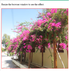
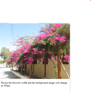
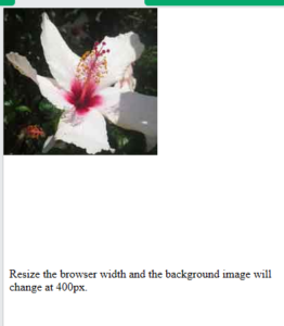
Different Images for Different Devices
A large image can be perfect on a big computer screen, but useless on a small device. Why load a large image when you have to scale it down anyway? To reduce the load, or for any other reasons, you can use media queries to display different images on different devices.
Example
|
1 2 3 4 5 6 7 8 9 10 11 12 13 14 15 16 17 18 19 20 21 22 23 24 25 |
<!DOCTYPE html> <html> <head> <meta name="viewport" content="width=device-width, initial-scale=1.0"> <style> /* For width smaller than 400px: */ body { background-repeat: no-repeat; background-image: url('img_smallflower.jpg'); } /* For width 400px and larger: */ @media only screen and (min-width: 400px) { body { background-image: url('img_flowers.jpg'); } } </style> </head> <body> <p style="margin-top:360px;">Resize the browser width and the background image will change at 400px.</p> </body> </html> |
Result
Screen Width above 400px
Screen Width below 400px
Responsive Web Design – Videos
Using The width Property
If the width property is set to 100%, the video player will be responsive and scale up and down:
Example
|
1 2 3 4 5 6 7 8 9 10 11 12 13 14 15 16 17 18 19 20 21 22 23 24 25 26 27 |
<!DOCTYPE html> <html> <head> <meta name="viewport" content="width=device-width, initial-scale=1.0"> <style> video { width: 100%; height: auto; } </style> </head> <body> <h1>Using width: 100%</h1> <p>If the width property is set to 100%, the video will scale up and down. It will even scale up to be larger than its original size.</p> <video width="400" controls> <source src="mov_bbb.mp4" type="video/mp4"> <source src="mov_bbb.ogg" type="video/ogg"> Your browser does not support HTML5 video. </video> <p>Resize the browser window to see the effect.</p> </body> </html> |
Result
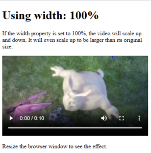
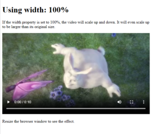
Using width: 100%
If the width property is set to 100%, the video will scale up and down. It will even scale up to be larger than its original size.
Resize the browser window to see the effect.
Screen Width above 600px
Screen Width below 600px