CSS translate Property
Change position of an element:
Definition and Usage
The translate property allows you to change the position of elements.
The translate property defines x- and y-coordinates of an element in 2D. You can also define the z-coordinate to change position in 3D.
Coordinates can be given as only x-coordinates, x- and y-coordinates, or x-, y- and z-coordinates.
To better understand the translate property, view a demo.
Example:
|
1 2 3 4 5 6 7 8 9 10 11 12 13 14 15 16 17 18 19 20 21 |
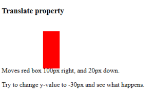
<!DOCTYPE html> <html> <head> <style> div { height: 90px; width: 40px; background-color: red; translate: 100px 20px; } </style> </head> <body> <h3>Translate property</h3> <div></div> <p>Moves red box 100px right, and 20px down.</p> <p>Try to change y-value to -30px and see what happens.</p> </body> </html> |
Result
CSS 2D Transforms
The CSS transform property applies a 2D or 3D transformation to an element. This property allows you to rotate, scale, move, and skew elements.
Mouse over the element below to see a 2D transformation:
CSS 2D Transforms Functions
With the CSS transform property you can use the following 2D transformation functions:
The CSS rotate() Function
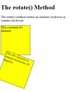
The rotate() function rotates an element clockwise or counter-clockwise according to a given degree.
The following example rotates the <div> element clockwise with 20 degrees:
Example
|
1 2 3 4 5 6 7 8 9 10 11 12 13 14 15 16 17 18 19 20 21 22 23 24 25 26 27 28 29 30 31 32 |
<!DOCTYPE html> <html> <head> <style> div { width: 150px; height: 150px; background-color: yellow; border: 1px solid black; } #myDiv { transform: rotate(20deg); } </style> </head> <body> <h1>The rotate() Method</h1> <p>The rotate() method rotates an element clockwise or counter-clockwise.</p> <div> This a normal div element. </div> <div id="myDiv"> This div element is rotated clockwise 20 degrees. </div> </body> </html> |
Result
The CSS scale() Function
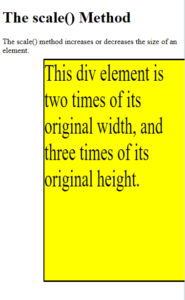
The scale() function increases or decreases the size of an element (according to the parameters given for the width and height).
The following example increases the <div> element to be two times of its original width, and three times of its original height:
Example
|
1 2 3 4 5 6 7 8 9 10 11 12 13 14 15 16 17 18 19 20 21 22 23 24 25 26 |
<!DOCTYPE html> <html> <head> <style> div { margin: 160px; width: 150px; height: 150px; background-color: yellow; border: 1px solid black; transform: scale(2,3); } </style> </head> <body> <h1>The scale() Method</h1> <p>The scale() method increases or decreases the size of an element.</p> <div> This div element is two times of its original width, and three times of its original height. </div> </body> </html> |
Result
The CSS scaleX() Function
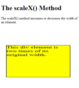
The scaleX() function increases or decreases the width of an element.
The following example increases the <div> element to be two times of its original width:
Example
|
1 2 3 4 5 6 7 8 9 10 11 12 13 14 15 16 17 18 19 20 21 22 23 24 25 26 |
<!DOCTYPE html> <html> <head> <style> div { margin: 100px; width: 150px; height: 150px; background-color: yellow; border: 1px solid black; transform: scaleX(2); } </style> </head> <body> <h1>The scaleX() Method</h1> <p>The scaleX() method increases or decreases the width of an element.</p> <div> This div element is two times of its original width. </div> </body> </html> |
Result
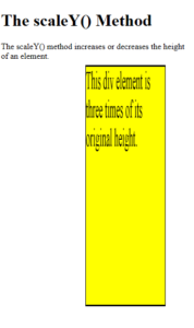
The CSS scaleY() Function
The scaleY() function increases or decreases the height of an element.
The following example increases the <div> element to be three times of its original height:
Example
|
1 2 3 4 5 6 7 8 9 10 11 12 13 14 15 16 17 18 19 20 21 22 23 24 25 26 |
<!DOCTYPE html> <html> <head> <style> div { margin: 160px; width: 150px; height: 150px; background-color: yellow; border: 1px solid black; transform: scaleY(3); } </style> </head> <body> <h1>The scaleY() Method</h1> <p>The scaleY() method increases or decreases the height of an element.</p> <div> This div element is three times of its original height. </div> </body> </html> |
Result
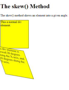
The CSS skew() Function
The skew() function skews an element along the X and Y-axis by the given angles.
The following example skews the <div> element 20 degrees along the X-axis, and 10 degrees along the Y-axis:
Example
|
1 2 3 4 5 6 7 8 9 10 11 12 13 14 15 16 17 18 19 20 21 22 23 24 25 26 27 28 29 30 31 |
<!DOCTYPE html> <html> <head> <style> div { width: 150px; height: 150px; background-color: yellow; border: 1px solid black; } #myDiv { transform: skew(20deg,10deg); } </style> </head> <body> <h1>The skew() Method</h1> <p>The skew() method skews an element into a given angle.</p> <div> This a normal div element. </div> <div id="myDiv"> This div element is skewed 20 degrees along the X-axis, and 10 degrees along the Y-axis. </div> </body> </html> |
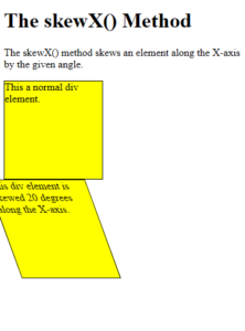
The CSS skewX() Function
The skewX() function skews an element along the X-axis by the given angle.
The following example skews the <div> element 20 degrees along the X-axis:
Example
|
1 2 3 4 5 6 7 8 9 10 11 12 13 14 15 16 17 18 19 20 21 22 23 24 25 26 27 28 29 30 31 32 |
<!DOCTYPE html> <html> <head> <style> div { width: 150px; height: 150px; background-color: yellow; border: 1px solid black; } #myDiv { transform: skewX(20deg); } </style> </head> <body> <h1>The skewX() Method</h1> <p>The skewX() method skews an element along the X-axis by the given angle.</p> <div> This a normal div element. </div> <div id="myDiv"> This div element is skewed 20 degrees along the X-axis. </div> </body> </html> |
Result
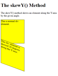
The CSS skewY() Function
The skewY() function skews an element along the Y-axis by the given angle.
The following example skews the <div> element 20 degrees along the Y-axis:
Example
|
1 2 3 4 5 6 7 8 9 10 11 12 13 14 15 16 17 18 19 20 21 22 23 24 25 26 27 28 29 30 31 32 |
<!DOCTYPE html> <html> <head> <style> div { width: 150px; height: 150px; background-color: yellow; border: 1px solid black; } #myDiv { transform: skewY(20deg); } </style> </head> <body> <h1>The skewY() Method</h1> <p>The skewY() method skews an element along the Y-axis by the given angle.</p> <div> This a normal div element. </div> <div id="myDiv"> This div element is skewed 20 degrees along the Y-axis. </div> </body> </html> |
Result
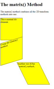
The CSS matrix() Function
The matrix() function combines all the 2D transform functions into one.
The matrix() function take six parameters, containing mathematic functions, which allows you to rotate, scale, move (translate), and skew elements.
The parameters are as follow: matrix(scaleX(), skewY(), skewX(), scaleY(), translateX(), translateY())
Example
|
1 2 3 4 5 6 7 8 9 10 11 12 13 14 15 16 17 18 19 20 21 22 23 24 25 26 27 28 29 30 31 32 33 34 35 36 37 38 39 40 |
<!DOCTYPE html> <html> <head> <style> div { width: 150px; height: 150px; background-color: yellow; border: 1px solid black; } #myDiv1 { transform: matrix(1, -0.3, 0, 1, 0, 0); } #myDiv2 { transform: matrix(1, 0, 0.5, 1, 150, 0); } </style> </head> <body> <h1>The matrix() Method</h1> <p>The matrix() method combines all the 2D transform methods into one.</p> <div> This a normal div element. </div> <div id="myDiv1"> Using the matrix() method. </div> <div id="myDiv2"> Another use of the matrix() method. </div> </body> </html> |
Result
CSS 2D Transform Functions
| Function | Description |
|---|---|
| matrix() | Defines a 2D transformation, using a matrix of six values |
| translate() | Defines a 2D translation, moving the element along the X- and the Y-axis |
| translateX() | Defines a 2D translation, moving the element along the X-axis |
| translateY() | Defines a 2D translation, moving the element along the Y-axis |
| scale() | Defines a 2D scale transformation, scaling the elements width and height |
| scaleX() | Defines a 2D scale transformation, scaling the element’s width |
| scaleY() | Defines a 2D scale transformation, scaling the element’s height |
| rotate() | Defines a 2D rotation, the angle is specified in the parameter |
| skew() | Defines a 2D skew transformation along the X- and the Y-axis |
| skewX() | Defines a 2D skew transformation along the X-axis |
| skewY() | Defines a 2D skew transformation along the Y-axis |